Design System Pro
UI UX pro max
UI/UX design intelligence. 50 styles, 21 palettes, 50 font pairings, 20 charts, 9 stacks (React, Next.js, Vue, Svelte, SwiftUI, React Native, Flutter, Tailwind, shadcn/ui).
---
name: ui-ux-pro-max
description: "UI/UX design intelligence. 50 styles, 21 palettes, 50 font pairings, 20 charts, 9 stacks (React, Next.js, Vue, Svelte, SwiftUI, React Native, Flutter, Tailwind, shadcn/ui). Actions: plan, build, create, design, implement, review, fix, improve, optimize, enhance, refactor, check UI/UX code. Projects: website, landing page, dashboard, admin panel, e-commerce, SaaS, portfolio, blog, mobile app, .html, .tsx, .vue, .svelte. Elements: button, modal, navbar, sidebar, card, table, form, chart. Styles: glassmorphism, claymorphism, minimalism, brutalism, neumorphism, bento grid, dark mode, responsive, skeuomorphism, flat design. Topics: color palette, accessibility, animation, layout, typography, font pairing, spacing, hover, shadow, gradient. Integrations: shadcn/ui MCP for component search and examples."
---

# UI/UX Pro Max - Design Intelligence

Comprehensive design guide for web and mobile applications. Contains 50+ styles, 97 color palettes, 57 font pairings, 99 UX guidelines, and 25 chart types across 9 technology stacks. Searchable database with priority-based recommendations.

## When to Apply

Reference these guidelines when:
- Designing new UI components or pages
- Choosing color palettes and typography
- Reviewing code for UX issues
- Building landing pages or dashboards
- Implementing accessibility requirements
Overview
Comprehensive design guide for web and mobile applications. Contains 50+ styles, 97 color palettes, 57 font pairings, 99 UX guidelines, and 25 chart types across 9 technology stacks. Searchable database with priority-based recommendations.
Manual install (npx, ZIP)
npx skills add davila7/claude-code-templates --skill ui-ux-pro-max -g -a claude-codenpx degit davila7/claude-code-templates/cli-tool/components/skills/creative-design/ui-ux-pro-max#main ~/.claude/skills/ui-ux-pro-max-davila7Connects with Agent Alley MCP · agentalley.io/mcp
Files included
SKILL.md12.8 KB
Read SKILL.md here
Show the full text352 lines
UI/UX Pro Max - Design Intelligence
Comprehensive design guide for web and mobile applications. Contains 50+ styles, 97 color palettes, 57 font pairings, 99 UX guidelines, and 25 chart types across 9 technology stacks. Searchable database with priority-based recommendations.
When to Apply
Reference these guidelines when:
- Designing new UI components or pages
- Choosing color palettes and typography
- Reviewing code for UX issues
- Building landing pages or dashboards
- Implementing accessibility requirements
Rule Categories by Priority
| Priority | Category | Impact | Domain |
|---|---|---|---|
| 1 | Accessibility | CRITICAL | ux |
| 2 | Touch & Interaction | CRITICAL | ux |
| 3 | Performance | HIGH | ux |
| 4 | Layout & Responsive | HIGH | ux |
| 5 | Typography & Color | MEDIUM | typography, color |
| 6 | Animation | MEDIUM | ux |
| 7 | Style Selection | MEDIUM | style, product |
| 8 | Charts & Data | LOW | chart |
Quick Reference
1. Accessibility (CRITICAL)
color-contrast- Minimum 4.5:1 ratio for normal textfocus-states- Visible focus rings on interactive elementsalt-text- Descriptive alt text for meaningful imagesaria-labels- aria-label for icon-only buttonskeyboard-nav- Tab order matches visual orderform-labels- Use label with for attribute
2. Touch & Interaction (CRITICAL)
touch-target-size- Minimum 44x44px touch targetshover-vs-tap- Use click/tap for primary interactionsloading-buttons- Disable button during async operationserror-feedback- Clear error messages near problemcursor-pointer- Add cursor-pointer to clickable elements
3. Performance (HIGH)
image-optimization- Use WebP, srcset, lazy loadingreduced-motion- Check prefers-reduced-motioncontent-jumping- Reserve space for async content
4. Layout & Responsive (HIGH)
viewport-meta- width=device-width initial-scale=1readable-font-size- Minimum 16px body text on mobilehorizontal-scroll- Ensure content fits viewport widthz-index-management- Define z-index scale (10, 20, 30, 50)
5. Typography & Color (MEDIUM)
line-height- Use 1.5-1.75 for body textline-length- Limit to 65-75 characters per linefont-pairing- Match heading/body font personalities
6. Animation (MEDIUM)
duration-timing- Use 150-300ms for micro-interactionstransform-performance- Use transform/opacity, not width/heightloading-states- Skeleton screens or spinners
7. Style Selection (MEDIUM)
style-match- Match style to product typeconsistency- Use same style across all pagesno-emoji-icons- Use SVG icons, not emojis
8. Charts & Data (LOW)
chart-type- Match chart type to data typecolor-guidance- Use accessible color palettesdata-table- Provide table alternative for accessibility
How to Use
Search specific domains using the CLI tool below.
Prerequisites
Check if Python is installed:
python3 --version || python --version
If Python is not installed, install it based on user's OS:
macOS:
brew install python3
Ubuntu/Debian:
sudo apt update && sudo apt install python3
Windows:
winget install Python.Python.3.12
How to Use This Skill
When user requests UI/UX work (design, build, create, implement, review, fix, improve), follow this workflow:
Step 1: Analyze User Requirements
Extract key information from user request:
- Product type: SaaS, e-commerce, portfolio, dashboard, landing page, etc.
- Style keywords: minimal, playful, professional, elegant, dark mode, etc.
- Industry: healthcare, fintech, gaming, education, etc.
- Stack: React, Vue, Next.js, or default to
html-tailwind
Step 2: Generate Design System (REQUIRED)
Always start with --design-system to get comprehensive recommendations with reasoning:
python3 .claude/skills/ui-ux-pro-max/scripts/search.py "<product_type> <industry> <keywords>" --design-system [-p "Project Name"]
This command:
- Searches 5 domains in parallel (product, style, color, landing, typography)
- Applies reasoning rules from
ui-reasoning.csvto select best matches - Returns complete design system: pattern, style, colors, typography, effects
- Includes anti-patterns to avoid
Example:
python3 .claude/skills/ui-ux-pro-max/scripts/search.py "beauty spa wellness service" --design-system -p "Serenity Spa"
Step 3: Supplement with Detailed Searches (as needed)
After getting the design system, use domain searches to get additional details:
python3 .claude/skills/ui-ux-pro-max/scripts/search.py "<keyword>" --domain <domain> [-n <max_results>]
When to use detailed searches:
| Need | Domain | Example |
|---|---|---|
| More style options | style |
--domain style "glassmorphism dark" |
| Chart recommendations | chart |
--domain chart "real-time dashboard" |
| UX best practices | ux |
--domain ux "animation accessibility" |
| Alternative fonts | typography |
--domain typography "elegant luxury" |
| Landing structure | landing |
--domain landing "hero social-proof" |
Step 4: Stack Guidelines (Default: html-tailwind)
Get implementation-specific best practices. If user doesn't specify a stack, default to html-tailwind.
python3 .claude/skills/ui-ux-pro-max/scripts/search.py "<keyword>" --stack html-tailwind
Available stacks: html-tailwind, react, nextjs, vue, svelte, swiftui, react-native, flutter, shadcn
Search Reference
Available Domains
| Domain | Use For | Example Keywords |
|---|---|---|
product |
Product type recommendations | SaaS, e-commerce, portfolio, healthcare, beauty, service |
style |
UI styles, colors, effects | glassmorphism, minimalism, dark mode, brutalism |
typography |
Font pairings, Google Fonts | elegant, playful, professional, modern |
color |
Color palettes by product type | saas, ecommerce, healthcare, beauty, fintech, service |
landing |
Page structure, CTA strategies | hero, hero-centric, testimonial, pricing, social-proof |
chart |
Chart types, library recommendations | trend, comparison, timeline, funnel, pie |
ux |
Best practices, anti-patterns | animation, accessibility, z-index, loading |
react |
React/Next.js performance | waterfall, bundle, suspense, memo, rerender, cache |
web |
Web interface guidelines | aria, focus, keyboard, semantic, virtualize |
prompt |
AI prompts, CSS keywords | (style name) |
Available Stacks
| Stack | Focus |
|---|---|
html-tailwind |
Tailwind utilities, responsive, a11y (DEFAULT) |
react |
State, hooks, performance, patterns |
nextjs |
SSR, routing, images, API routes |
vue |
Composition API, Pinia, Vue Router |
svelte |
Runes, stores, SvelteKit |
swiftui |
Views, State, Navigation, Animation |
react-native |
Components, Navigation, Lists |
flutter |
Widgets, State, Layout, Theming |
shadcn |
shadcn/ui components, theming, forms, patterns |
Example Workflow
User request: "Làm landing page cho dịch vụ chăm sóc da chuyên nghiệp"
Step 1: Analyze Requirements
- Product type: Beauty/Spa service
- Style keywords: elegant, professional, soft
- Industry: Beauty/Wellness
- Stack: html-tailwind (default)
Step 2: Generate Design System (REQUIRED)
python3 .claude/skills/ui-ux-pro-max/scripts/search.py "beauty spa wellness service elegant" --design-system -p "Serenity Spa"
Output: Complete design system with pattern, style, colors, typography, effects, and anti-patterns.
Step 3: Supplement with Detailed Searches (as needed)
# Get UX guidelines for animation and accessibility
python3 .claude/skills/ui-ux-pro-max/scripts/search.py "animation accessibility" --domain ux

# Get alternative typography options if needed
python3 .claude/skills/ui-ux-pro-max/scripts/search.py "elegant luxury serif" --domain typography
Step 4: Stack Guidelines
python3 .claude/skills/ui-ux-pro-max/scripts/search.py "layout responsive form" --stack html-tailwind
Then: Synthesize design system + detailed searches and implement the design.
Output Formats
The --design-system flag supports two output formats:
# ASCII box (default) - best for terminal display
python3 .claude/skills/ui-ux-pro-max/scripts/search.py "fintech crypto" --design-system

# Markdown - best for documentation
python3 .claude/skills/ui-ux-pro-max/scripts/search.py "fintech crypto" --design-system -f markdown
Tips for Better Results
- Be specific with keywords - "healthcare SaaS dashboard" > "app"
- Search multiple times - Different keywords reveal different insights
- Combine domains - Style + Typography + Color = Complete design system
- Always check UX - Search "animation", "z-index", "accessibility" for common issues
- Use stack flag - Get implementation-specific best practices
- Iterate - If first search doesn't match, try different keywords
Common Rules for Professional UI
These are frequently overlooked issues that make UI look unprofessional:
Icons & Visual Elements
| Rule | Do | Don't |
|---|---|---|
| No emoji icons | Use SVG icons (Heroicons, Lucide, Simple Icons) | Use emojis like 🎨 🚀 ⚙️ as UI icons |
| Stable hover states | Use color/opacity transitions on hover | Use scale transforms that shift layout |
| Correct brand logos | Research official SVG from Simple Icons | Guess or use incorrect logo paths |
| Consistent icon sizing | Use fixed viewBox (24x24) with w-6 h-6 | Mix different icon sizes randomly |
Interaction & Cursor
| Rule | Do | Don't |
|---|---|---|
| Cursor pointer | Add cursor-pointer to all clickable/hoverable cards |
Leave default cursor on interactive elements |
| Hover feedback | Provide visual feedback (color, shadow, border) | No indication element is interactive |
| Smooth transitions | Use transition-colors duration-200 |
Instant state changes or too slow (>500ms) |
Light/Dark Mode Contrast
| Rule | Do | Don't |
|---|---|---|
| Glass card light mode | Use bg-white/80 or higher opacity |
Use bg-white/10 (too transparent) |
| Text contrast light | Use #0F172A (slate-900) for text |
Use #94A3B8 (slate-400) for body text |
| Muted text light | Use #475569 (slate-600) minimum |
Use gray-400 or lighter |
| Border visibility | Use border-gray-200 in light mode |
Use border-white/10 (invisible) |
Layout & Spacing
| Rule | Do | Don't |
|---|---|---|
| Floating navbar | Add top-4 left-4 right-4 spacing |
Stick navbar to top-0 left-0 right-0 |
| Content padding | Account for fixed navbar height | Let content hide behind fixed elements |
| Consistent max-width | Use same max-w-6xl or max-w-7xl |
Mix different container widths |
Pre-Delivery Checklist
Before delivering UI code, verify these items:
Visual Quality
- No emojis used as icons (use SVG instead)
- All icons from consistent icon set (Heroicons/Lucide)
- Brand logos are correct (verified from Simple Icons)
- Hover states don't cause layout shift
- Use theme colors directly (bg-primary) not var() wrapper
Interaction
- All clickable elements have
cursor-pointer - Hover states provide clear visual feedback
- Transitions are smooth (150-300ms)
- Focus states visible for keyboard navigation
Light/Dark Mode
- Light mode text has sufficient contrast (4.5:1 minimum)
- Glass/transparent elements visible in light mode
- Borders visible in both modes
- Test both modes before delivery
Layout
- Floating elements have proper spacing from edges
- No content hidden behind fixed navbars
- Responsive at 375px, 768px, 1024px, 1440px
- No horizontal scroll on mobile
Accessibility
- All images have alt text
- Form inputs have labels
- Color is not the only indicator
-
prefers-reduced-motionrespected
| 1 | |
| 2 | name ui-ux-pro-max |
| 3 | description "UI/UX design intelligence. 50 styles, 21 palettes, 50 font pairings, 20 charts, 9 stacks (React, Next.js, Vue, Svelte, SwiftUI, React Native, Flutter, Tailwind, shadcn/ui). Actions: plan, build, create, design, implement, review, fix, improve, optimize, enhance, refactor, check UI/UX code. Projects: website, landing page, dashboard, admin panel, e-commerce, SaaS, portfolio, blog, mobile app, .html, .tsx, .vue, .svelte. Elements: button, modal, navbar, sidebar, card, table, form, chart. Styles: glassmorphism, claymorphism, minimalism, brutalism, neumorphism, bento grid, dark mode, responsive, skeuomorphism, flat design. Topics: color palette, accessibility, animation, layout, typography, font pairing, spacing, hover, shadow, gradient. Integrations: shadcn/ui MCP for component search and examples." |
| 4 | |
| 5 | |
| 6 | # UI/UX Pro Max - Design Intelligence |
| 7 | |
| 8 | Comprehensive design guide for web and mobile applications. Contains 50+ styles, 97 color palettes, 57 font pairings, 99 UX guidelines, and 25 chart types across 9 technology stacks. Searchable database with priority-based recommendations. |
| 9 | |
| 10 | ## When to Apply |
| 11 | |
| 12 | Reference these guidelines when: |
| 13 | Designing new UI components or pages |
| 14 | Choosing color palettes and typography |
| 15 | Reviewing code for UX issues |
| 16 | Building landing pages or dashboards |
| 17 | Implementing accessibility requirements |
| 18 | |
| 19 | ## Rule Categories by Priority |
| 20 | |
| 21 | | Priority | Category | Impact | Domain | |
| 22 | |----------|----------|--------|--------| |
| 23 | | 1 | Accessibility | CRITICAL | `ux` | |
| 24 | | 2 | Touch & Interaction | CRITICAL | `ux` | |
| 25 | | 3 | Performance | HIGH | `ux` | |
| 26 | | 4 | Layout & Responsive | HIGH | `ux` | |
| 27 | | 5 | Typography & Color | MEDIUM | `typography`, `color` | |
| 28 | | 6 | Animation | MEDIUM | `ux` | |
| 29 | | 7 | Style Selection | MEDIUM | `style`, `product` | |
| 30 | | 8 | Charts & Data | LOW | `chart` | |
| 31 | |
| 32 | ## Quick Reference |
| 33 | |
| 34 | ### 1. Accessibility (CRITICAL) |
| 35 | |
| 36 | `color-contrast` - Minimum 4.5:1 ratio for normal text |
| 37 | `focus-states` - Visible focus rings on interactive elements |
| 38 | `alt-text` - Descriptive alt text for meaningful images |
| 39 | `aria-labels` - aria-label for icon-only buttons |
| 40 | `keyboard-nav` - Tab order matches visual order |
| 41 | `form-labels` - Use label with for attribute |
| 42 | |
| 43 | ### 2. Touch & Interaction (CRITICAL) |
| 44 | |
| 45 | `touch-target-size` - Minimum 44x44px touch targets |
| 46 | `hover-vs-tap` - Use click/tap for primary interactions |
| 47 | `loading-buttons` - Disable button during async operations |
| 48 | `error-feedback` - Clear error messages near problem |
| 49 | `cursor-pointer` - Add cursor-pointer to clickable elements |
| 50 | |
| 51 | ### 3. Performance (HIGH) |
| 52 | |
| 53 | `image-optimization` - Use WebP, srcset, lazy loading |
| 54 | `reduced-motion` - Check prefers-reduced-motion |
| 55 | `content-jumping` - Reserve space for async content |
| 56 | |
| 57 | ### 4. Layout & Responsive (HIGH) |
| 58 | |
| 59 | `viewport-meta` - width=device-width initial-scale=1 |
| 60 | `readable-font-size` - Minimum 16px body text on mobile |
| 61 | `horizontal-scroll` - Ensure content fits viewport width |
| 62 | `z-index-management` - Define z-index scale (10, 20, 30, 50) |
| 63 | |
| 64 | ### 5. Typography & Color (MEDIUM) |
| 65 | |
| 66 | `line-height` - Use 1.5-1.75 for body text |
| 67 | `line-length` - Limit to 65-75 characters per line |
| 68 | `font-pairing` - Match heading/body font personalities |
| 69 | |
| 70 | ### 6. Animation (MEDIUM) |
| 71 | |
| 72 | `duration-timing` - Use 150-300ms for micro-interactions |
| 73 | `transform-performance` - Use transform/opacity, not width/height |
| 74 | `loading-states` - Skeleton screens or spinners |
| 75 | |
| 76 | ### 7. Style Selection (MEDIUM) |
| 77 | |
| 78 | `style-match` - Match style to product type |
| 79 | `consistency` - Use same style across all pages |
| 80 | `no-emoji-icons` - Use SVG icons, not emojis |
| 81 | |
| 82 | ### 8. Charts & Data (LOW) |
| 83 | |
| 84 | `chart-type` - Match chart type to data type |
| 85 | `color-guidance` - Use accessible color palettes |
| 86 | `data-table` - Provide table alternative for accessibility |
| 87 | |
| 88 | ## How to Use |
| 89 | |
| 90 | Search specific domains using the CLI tool below. |
| 91 | |
| 92 | |
| 93 | |
| 94 | ## Prerequisites |
| 95 | |
| 96 | Check if Python is installed: |
| 97 | |
| 98 | |
| 99 | python3 --version || python --version |
| 100 | |
| 101 | |
| 102 | If Python is not installed, install it based on user's OS: |
| 103 | |
| 104 | **macOS:** |
| 105 | |
| 106 | brew install python3 |
| 107 | |
| 108 | |
| 109 | **Ubuntu/Debian:** |
| 110 | |
| 111 | sudo apt update && sudo apt install python3 |
| 112 | |
| 113 | |
| 114 | **Windows:** |
| 115 | |
| 116 | winget install Python.Python.3.12 |
| 117 | |
| 118 | |
| 119 | |
| 120 | |
| 121 | ## How to Use This Skill |
| 122 | |
| 123 | When user requests UI/UX work (design, build, create, implement, review, fix, improve), follow this workflow: |
| 124 | |
| 125 | ### Step 1: Analyze User Requirements |
| 126 | |
| 127 | Extract key information from user request: |
| 128 | **Product type**: SaaS, e-commerce, portfolio, dashboard, landing page, etc. |
| 129 | **Style keywords**: minimal, playful, professional, elegant, dark mode, etc. |
| 130 | **Industry**: healthcare, fintech, gaming, education, etc. |
| 131 | **Stack**: React, Vue, Next.js, or default to `html-tailwind` |
| 132 | |
| 133 | ### Step 2: Generate Design System (REQUIRED) |
| 134 | |
| 135 | **Always start with `--design-system`** to get comprehensive recommendations with reasoning: |
| 136 | |
| 137 | |
| 138 | python3 .claude/skills/ui-ux-pro-max/scripts/search.py "<product_type> <industry> <keywords>" --design-system [-p "Project Name"] |
| 139 | |
| 140 | |
| 141 | This command: |
| 142 | Searches 5 domains in parallel (product, style, color, landing, typography) |
| 143 | Applies reasoning rules from `ui-reasoning.csv` to select best matches |
| 144 | Returns complete design system: pattern, style, colors, typography, effects |
| 145 | Includes anti-patterns to avoid |
| 146 | |
| 147 | **Example:** |
| 148 | |
| 149 | python3 .claude/skills/ui-ux-pro-max/scripts/search.py "beauty spa wellness service" --design-system -p "Serenity Spa" |
| 150 | |
| 151 | |
| 152 | ### Step 3: Supplement with Detailed Searches (as needed) |
| 153 | |
| 154 | After getting the design system, use domain searches to get additional details: |
| 155 | |
| 156 | |
| 157 | python3 .claude/skills/ui-ux-pro-max/scripts/search.py "<keyword>" --domain <domain> [-n <max_results>] |
| 158 | |
| 159 | |
| 160 | **When to use detailed searches:** |
| 161 | |
| 162 | | Need | Domain | Example | |
| 163 | |------|--------|---------| |
| 164 | | More style options | `style` | `--domain style "glassmorphism dark"` | |
| 165 | | Chart recommendations | `chart` | `--domain chart "real-time dashboard"` | |
| 166 | | UX best practices | `ux` | `--domain ux "animation accessibility"` | |
| 167 | | Alternative fonts | `typography` | `--domain typography "elegant luxury"` | |
| 168 | | Landing structure | `landing` | `--domain landing "hero social-proof"` | |
| 169 | |
| 170 | ### Step 4: Stack Guidelines (Default: html-tailwind) |
| 171 | |
| 172 | Get implementation-specific best practices. If user doesn't specify a stack, **default to `html-tailwind`**. |
| 173 | |
| 174 | |
| 175 | python3 .claude/skills/ui-ux-pro-max/scripts/search.py "<keyword>" --stack html-tailwind |
| 176 | |
| 177 | |
| 178 | Available stacks: `html-tailwind`, `react`, `nextjs`, `vue`, `svelte`, `swiftui`, `react-native`, `flutter`, `shadcn` |
| 179 | |
| 180 | |
| 181 | |
| 182 | ## Search Reference |
| 183 | |
| 184 | ### Available Domains |
| 185 | |
| 186 | | Domain | Use For | Example Keywords | |
| 187 | |--------|---------|------------------| |
| 188 | | `product` | Product type recommendations | SaaS, e-commerce, portfolio, healthcare, beauty, service | |
| 189 | | `style` | UI styles, colors, effects | glassmorphism, minimalism, dark mode, brutalism | |
| 190 | | `typography` | Font pairings, Google Fonts | elegant, playful, professional, modern | |
| 191 | | `color` | Color palettes by product type | saas, ecommerce, healthcare, beauty, fintech, service | |
| 192 | | `landing` | Page structure, CTA strategies | hero, hero-centric, testimonial, pricing, social-proof | |
| 193 | | `chart` | Chart types, library recommendations | trend, comparison, timeline, funnel, pie | |
| 194 | | `ux` | Best practices, anti-patterns | animation, accessibility, z-index, loading | |
| 195 | | `react` | React/Next.js performance | waterfall, bundle, suspense, memo, rerender, cache | |
| 196 | | `web` | Web interface guidelines | aria, focus, keyboard, semantic, virtualize | |
| 197 | | `prompt` | AI prompts, CSS keywords | (style name) | |
| 198 | |
| 199 | ### Available Stacks |
| 200 | |
| 201 | | Stack | Focus | |
| 202 | |-------|-------| |
| 203 | | `html-tailwind` | Tailwind utilities, responsive, a11y (DEFAULT) | |
| 204 | | `react` | State, hooks, performance, patterns | |
| 205 | | `nextjs` | SSR, routing, images, API routes | |
| 206 | | `vue` | Composition API, Pinia, Vue Router | |
| 207 | | `svelte` | Runes, stores, SvelteKit | |
| 208 | | `swiftui` | Views, State, Navigation, Animation | |
| 209 | | `react-native` | Components, Navigation, Lists | |
| 210 | | `flutter` | Widgets, State, Layout, Theming | |
| 211 | | `shadcn` | shadcn/ui components, theming, forms, patterns | |
| 212 | |
| 213 | |
| 214 | |
| 215 | ## Example Workflow |
| 216 | |
| 217 | **User request:** "Làm landing page cho dịch vụ chăm sóc da chuyên nghiệp" |
| 218 | |
| 219 | ### Step 1: Analyze Requirements |
| 220 | Product type: Beauty/Spa service |
| 221 | Style keywords: elegant, professional, soft |
| 222 | Industry: Beauty/Wellness |
| 223 | Stack: html-tailwind (default) |
| 224 | |
| 225 | ### Step 2: Generate Design System (REQUIRED) |
| 226 | |
| 227 | |
| 228 | python3 .claude/skills/ui-ux-pro-max/scripts/search.py "beauty spa wellness service elegant" --design-system -p "Serenity Spa" |
| 229 | |
| 230 | |
| 231 | **Output:** Complete design system with pattern, style, colors, typography, effects, and anti-patterns. |
| 232 | |
| 233 | ### Step 3: Supplement with Detailed Searches (as needed) |
| 234 | |
| 235 | |
| 236 | # Get UX guidelines for animation and accessibility |
| 237 | python3 .claude/skills/ui-ux-pro-max/scripts/search.py "animation accessibility" --domain ux |
| 238 | |
| 239 | # Get alternative typography options if needed |
| 240 | python3 .claude/skills/ui-ux-pro-max/scripts/search.py "elegant luxury serif" --domain typography |
| 241 | |
| 242 | |
| 243 | ### Step 4: Stack Guidelines |
| 244 | |
| 245 | |
| 246 | python3 .claude/skills/ui-ux-pro-max/scripts/search.py "layout responsive form" --stack html-tailwind |
| 247 | |
| 248 | |
| 249 | **Then:** Synthesize design system + detailed searches and implement the design. |
| 250 | |
| 251 | |
| 252 | |
| 253 | ## Output Formats |
| 254 | |
| 255 | The `--design-system` flag supports two output formats: |
| 256 | |
| 257 | |
| 258 | # ASCII box (default) - best for terminal display |
| 259 | python3 .claude/skills/ui-ux-pro-max/scripts/search.py "fintech crypto" --design-system |
| 260 | |
| 261 | # Markdown - best for documentation |
| 262 | python3 .claude/skills/ui-ux-pro-max/scripts/search.py "fintech crypto" --design-system -f markdown |
| 263 | |
| 264 | |
| 265 | |
| 266 | |
| 267 | ## Tips for Better Results |
| 268 | |
| 269 | **Be specific with keywords** - "healthcare SaaS dashboard" > "app" |
| 270 | **Search multiple times** - Different keywords reveal different insights |
| 271 | **Combine domains** - Style + Typography + Color = Complete design system |
| 272 | **Always check UX** - Search "animation", "z-index", "accessibility" for common issues |
| 273 | **Use stack flag** - Get implementation-specific best practices |
| 274 | **Iterate** - If first search doesn't match, try different keywords |
| 275 | |
| 276 | |
| 277 | |
| 278 | ## Common Rules for Professional UI |
| 279 | |
| 280 | These are frequently overlooked issues that make UI look unprofessional: |
| 281 | |
| 282 | ### Icons & Visual Elements |
| 283 | |
| 284 | | Rule | Do | Don't | |
| 285 | |------|----|----- | |
| 286 | | **No emoji icons** | Use SVG icons (Heroicons, Lucide, Simple Icons) | Use emojis like 🎨 🚀 ⚙️ as UI icons | |
| 287 | | **Stable hover states** | Use color/opacity transitions on hover | Use scale transforms that shift layout | |
| 288 | | **Correct brand logos** | Research official SVG from Simple Icons | Guess or use incorrect logo paths | |
| 289 | | **Consistent icon sizing** | Use fixed viewBox (24x24) with w-6 h-6 | Mix different icon sizes randomly | |
| 290 | |
| 291 | ### Interaction & Cursor |
| 292 | |
| 293 | | Rule | Do | Don't | |
| 294 | |------|----|----- | |
| 295 | | **Cursor pointer** | Add `cursor-pointer` to all clickable/hoverable cards | Leave default cursor on interactive elements | |
| 296 | | **Hover feedback** | Provide visual feedback (color, shadow, border) | No indication element is interactive | |
| 297 | | **Smooth transitions** | Use `transition-colors duration-200` | Instant state changes or too slow (>500ms) | |
| 298 | |
| 299 | ### Light/Dark Mode Contrast |
| 300 | |
| 301 | | Rule | Do | Don't | |
| 302 | |------|----|----- | |
| 303 | | **Glass card light mode** | Use `bg-white/80` or higher opacity | Use `bg-white/10` (too transparent) | |
| 304 | | **Text contrast light** | Use `#0F172A` (slate-900) for text | Use `#94A3B8` (slate-400) for body text | |
| 305 | | **Muted text light** | Use `#475569` (slate-600) minimum | Use gray-400 or lighter | |
| 306 | | **Border visibility** | Use `border-gray-200` in light mode | Use `border-white/10` (invisible) | |
| 307 | |
| 308 | ### Layout & Spacing |
| 309 | |
| 310 | | Rule | Do | Don't | |
| 311 | |------|----|----- | |
| 312 | | **Floating navbar** | Add `top-4 left-4 right-4` spacing | Stick navbar to `top-0 left-0 right-0` | |
| 313 | | **Content padding** | Account for fixed navbar height | Let content hide behind fixed elements | |
| 314 | | **Consistent max-width** | Use same `max-w-6xl` or `max-w-7xl` | Mix different container widths | |
| 315 | |
| 316 | |
| 317 | |
| 318 | ## Pre-Delivery Checklist |
| 319 | |
| 320 | Before delivering UI code, verify these items: |
| 321 | |
| 322 | ### Visual Quality |
| 323 | [ ] No emojis used as icons (use SVG instead) |
| 324 | [ ] All icons from consistent icon set (Heroicons/Lucide) |
| 325 | [ ] Brand logos are correct (verified from Simple Icons) |
| 326 | [ ] Hover states don't cause layout shift |
| 327 | [ ] Use theme colors directly (bg-primary) not var() wrapper |
| 328 | |
| 329 | ### Interaction |
| 330 | [ ] All clickable elements have `cursor-pointer` |
| 331 | [ ] Hover states provide clear visual feedback |
| 332 | [ ] Transitions are smooth (150-300ms) |
| 333 | [ ] Focus states visible for keyboard navigation |
| 334 | |
| 335 | ### Light/Dark Mode |
| 336 | [ ] Light mode text has sufficient contrast (4.5:1 minimum) |
| 337 | [ ] Glass/transparent elements visible in light mode |
| 338 | [ ] Borders visible in both modes |
| 339 | [ ] Test both modes before delivery |
| 340 | |
| 341 | ### Layout |
| 342 | [ ] Floating elements have proper spacing from edges |
| 343 | [ ] No content hidden behind fixed navbars |
| 344 | [ ] Responsive at 375px, 768px, 1024px, 1440px |
| 345 | [ ] No horizontal scroll on mobile |
| 346 | |
| 347 | ### Accessibility |
| 348 | [ ] All images have alt text |
| 349 | [ ] Form inputs have labels |
| 350 | [ ] Color is not the only indicator |
| 351 | [ ] `prefers-reduced-motion` respected |
| 352 |
Details
- License
- MIT
- Stars on the repo
- ★ 32,299
- Checked
- Source
- davila7/claude-code-templates ↗
- Creator
- davila7 · 212 listings
Similar skills
See all → SkillMotion Effect Glossary
 emilkowalski/skills · by emilkowalskiReverse-lookup glossary that turns a vague description of a web animation or motion effect into its exact term ("the bouncy thing when a popover opens" → Pop in; "the iOS rubber-band scroll" → Rubber-banding). Use when the user asks "what's it called when…", or describes a motion effect without knowing its name and wants the right word to prompt an AI or designer with. For naming an effect, not designing or building one.★ 40.8k GitHub stars
 SkillWatercolor Animation Generator
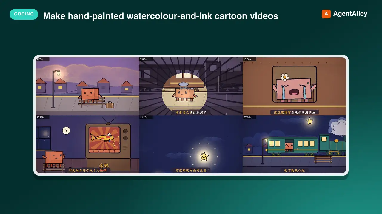
 edenfunf/reelmimic · by edenfunfMake hand-painted watercolour-and-ink cartoon videos (MP4) with code — p5.js + p5.brush rendered frame by frame in headless Chrome, encoded with ffmpeg — starring Clawd or any character. Use when the user asks to make an animation, animated short, cartoon, music video, lyric video, animated GIF/loop or "a video of Clawd…", or mentions the PDoomVideo / ClaudeAnimationBase approach. Covers storyboarding, the engine API, the render-and-look review loop, music/lyric sync and splitting long videos across subagents.★ 3.6k GitHub stars
 SkillModern Web Reference
 GoogleChrome/modern-web-guidance · by GoogleChromeSearch tool for modern web development best practices. MANDATORY: Execute FIRST for all HTML/CSS and clientside JS tasks. Do NOT skip — web APIs evolve rapidly and training weights contain obsolete patterns. Trigger immediately for: - UI/Layout: Modals, dialogs, popovers, Glassmorphism/backdrop-filters, anchor positioning, container queries, `:has()`, `:user-valid`. - Scroll/Motion: View Transitions, Scroll-driven animations, scroll parallax/reveals. - Performance: CWV (LCP, INP), content-visibility, Fetch Priority, image optimization. - System/APIs: Local filesystem access, WebUSB, WebSockets sync, WebAssembly widgets. - Frameworks: Adapting layout/styles in React, Vue, Angular. - General Frontend: Forms, autofill, advanced inputs, custom scrollbars, modern component states, etc. DO NOT trigger for: - Backend: Database SQL, ORMs, Express API routes. - Pipelines: CI/CD deployment, Docker, Actions. - Generic: Local scripts (Python/Go tools), ESLint, Git.★ 2.4k GitHub stars
 SkillMotion Graphics Translator
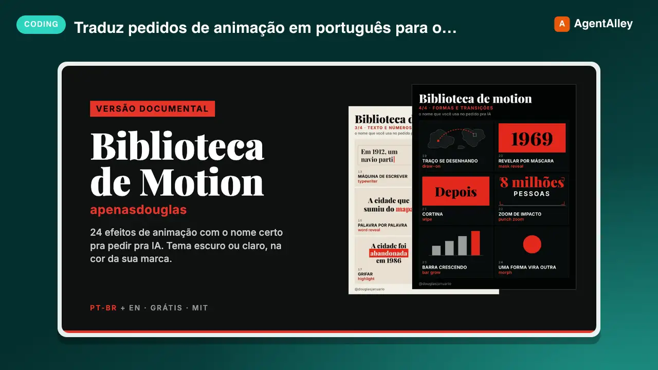
 apenasdouglas/ai-motion-library · by apenasdouglasTraduz pedidos de animação em português ("faz o número quicar", "entra um depois do outro", "dá um tranco no zoom") para o efeito de motion graphics certo, com o termo técnico, a duração e a aceleração. Use sempre que o usuário pedir animação, motion, transição ou efeito em vídeo, HTML, CSS, GSAP, Remotion, HyperFrames ou After Effects, principalmente quando o pedido for vago ("faz uma animação bonita") ou o vídeo for de canal dark (faceless) de curiosidades, história ou documentário. Also triggers on English requests for motion graphics, easing and animation effects in documentary or faceless YouTube videos.★ 68 GitHub stars
 SkillBrowser Automation Tool
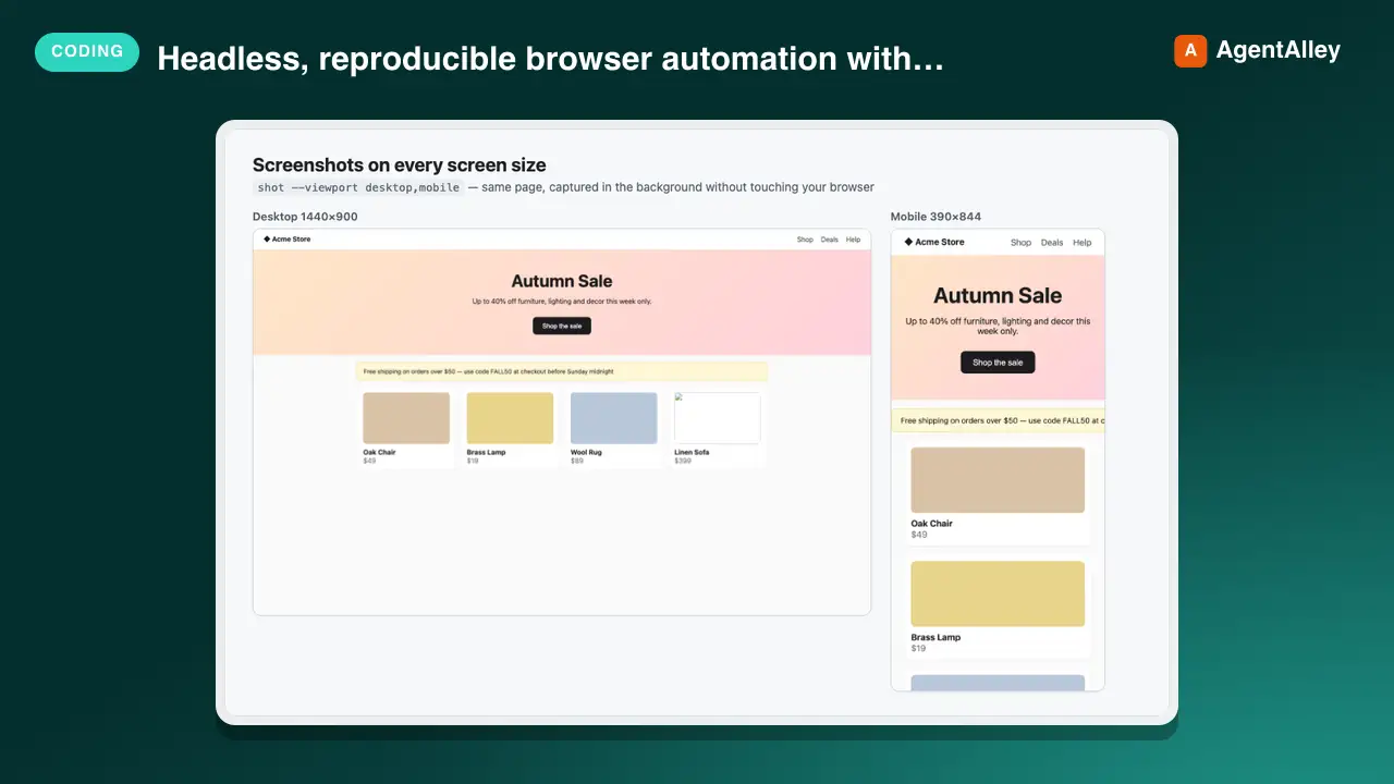
 AndyShiu/claude-skill-playwright-browser · by AndyShiuHeadless, reproducible browser automation with Playwright for any project — screenshots of web pages or local dev servers (desktop/tablet/mobile, full page or one element, single page or every page/menu of an app in one batch), frontend audits (console errors, failed requests, broken images/links, responsive overflow, axe accessibility, LCP/CLS performance), before/after visual comparison, scripted E2E flows (log in, click, fill, page through, assert), and logged-in pages via saved sessions. Use this whenever the user wants to screenshot or visually check a site, find frontend bugs, see how a page looks on mobile, compare the UI before and after a CSS/code change, reproduce a bug from an issue or ticket and capture evidence images for it, verify a UI flow works, or run/write a browser test — even if they never say "Playwright" or "browser". If Claude in Chrome could also do the job, briefly ask which to use (with a recommendation) instead of silently picking.★ 49 GitHub stars
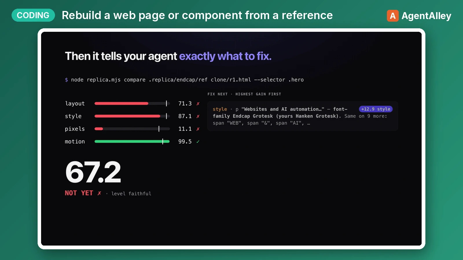 SkillComponent Rebuilder
 albertirgi/replica · by albertirgiRebuild a web page, section, component or interaction from a reference (a live URL, a local HTML file, a screenshot or design export, or a screen recording or GIF) inside the user's own codebase. Then measure the rebuild against the reference (element boxes, computed styles, pixels, motion timing and easing) and iterate until a numeric Replica Score passes. Use when the user wants to clone, replicate, recreate, copy, port or match a site, landing page, hero, navbar, pricing table, card, modal, footer, hover effect, scroll reveal, page-load animation or any other UI, or to "make it look/feel/move like" one. Also use when they say "pixel-perfect", "1:1", "exactly like this" or "same as <url>", or hand over a screenshot, Figma export or video and ask to build it, including when they want their own copy, brand or extra features on top.★ 43 GitHub stars
More from davila7
 Skill2D Game Development
 davila7/claude-code-templates · by davila72D game development principles. Sprites, tilemaps, physics, camera.★ 32.3k GitHub stars
 Skill3D Game Development Principlesdavila7/claude-code-templates · by davila73D game development principles. Rendering, shaders, physics, cameras.★ 32.3k GitHub stars
 Skill3D Web Experience Builderdavila7/claude-code-templates · by davila7Expert in building 3D experiences for the web - Three.js, React Three Fiber, Spline, WebGL, and interactive 3D scenes. Covers product configurators, 3D portfolios, immersive websites, and bringing depth to web experiences. Use when: 3D website, three.js, WebGL, react three fiber, 3D experience.★ 32.3k GitHub stars
 SkillSplit Test Setupdavila7/claude-code-templates · by davila7When the user wants to plan, design, or implement an A/B test or experiment. Also use when the user mentions "A/B test," "split test," "experiment," "test this change," "variant copy," "multivariate test," or "hypothesis." For tracking implementation, see analytics-tracking.★ 32.3k GitHub stars
 AgentResearch Literature Synthesizerdavila7/claude-code-templates · by davila7Academic research synthesis specialist. Use PROACTIVELY for comprehensive research on academic topics, literature reviews, technical investigations, and well-cited analysis combining multiple sources. <example>Context: A podcast episode needs a segment grounded in peer-reviewed evidence with formal citations. user: "Research the current state of transformer efficiency techniques for the episode, with proper academic citations." assistant: "I'll use the academic-research-synthesizer agent to search arXiv and Semantic Scholar, extract full-text findings via WebFetch, and produce a cited literature synthesis with confidence levels." <commentary>Use academic-research-synthesizer (not comprehensive-researcher) when the episode segment needs peer-reviewed sourcing, formal citation format, and explicit confidence tagging rather than general-purpose multi-source coverage.</commentary></example> <example>Context: The episode-orchestrator has routed a "literature review" request for a technical deep-dive segment. user: "Summarize the research landscape on federated learning privacy guarantees." assistant: "I'll invoke academic-research-synthesizer to systematically search academic sources, note peer-review status per source, and synthesize consensus vs. open debates."</example>★ 32.3k GitHub stars
 AgentAcademic Research Specialistdavila7/claude-code-templates · by davila7Academic research specialist for scholarly sources, peer-reviewed papers, and academic literature. Use PROACTIVELY for research paper analysis, literature reviews, citation tracking, and academic methodology evaluation. <example>Context: The research-orchestrator has kicked off Phase 4 parallel research on 'efficacy of intermittent fasting' and needs peer-reviewed evidence. user: "Find the academic evidence on intermittent fasting outcomes." assistant: "I'll use the academic-researcher agent to search Semantic Scholar, PubMed, and OpenAlex for peer-reviewed studies and write structured findings to academic-research.md." <commentary>The request is specifically for scholarly/peer-reviewed evidence rather than general web coverage or code, so academic-researcher (not web-researcher or technical-researcher) is the right specialist.</commentary></example> <example>Context: The user wants a literature review comparing methodologies across studies on a topic. user: "Can you review the literature on transformer model interpretability and identify research gaps?" assistant: "Let me invoke the academic-researcher agent to pull foundational and recent papers, extract methodologies, and surface open research gaps." <commentary>Literature review, methodology extraction, and research-gap identification are core academic-researcher capabilities, distinct from technical-researcher's focus on code repositories and implementations.</commentary></example>★ 32.3k GitHub stars