iOS Widgets & Extensions
iOS Widgets & App Extensions
Design guidelines for widgets, App Clips, and system extensions.
# iOS Widgets & App Extensions

Design guidelines for widgets, App Clips, and system extensions.


## Table of Contents
1. [Widget Design](#widget-design)
2. [Widget Configuration](#widget-configuration)
3. [App Clips](#app-clips)
4. [Share Extensions](#share-extensions)
5. [Action Extensions](#action-extensions)
6. [Live Activities](#live-activities)
7. [Widget Development Tips](#widget-development-tips)

---

## Widget Design
Overview
Design guidelines for widgets, App Clips, and system extensions.
Manual install (npx, ZIP)
npx skills add wondelai/skills --skill ios-widgets-app-extensions -g -a claude-codeConnects with Agent Alley MCP · agentalley.io/mcp
Files included
widgets-extensions.md13.5 KB
Read widgets-extensions.md here
wondelai/
Show the full text426 lines
iOS Widgets & App Extensions
Design guidelines for widgets, App Clips, and system extensions.
Table of Contents
- Widget Design
- Widget Configuration
- App Clips
- Share Extensions
- Action Extensions
- Live Activities
- Widget Development Tips
Widget Design
Widget Philosophy
Widgets provide glanceable information on the Home Screen, Lock Screen, and StandBy mode. They are not mini-apps—they're windows into your app's most useful content.
Key principles:
- Show immediately useful information
- Update content thoughtfully (not constantly)
- Respect the user's Home Screen aesthetic
- Drive users to the app for deeper engagement
Widget Sizes
Home Screen widgets:
| Size | Name | Grid Units | Use Case |
|---|---|---|---|
| Small | systemSmall |
2×2 | Single piece of information |
| Medium | systemMedium |
4×2 | Key content + one interaction |
| Large | systemLarge |
4×4 | Rich content, multiple items |
| Extra Large | systemExtraLarge |
8×4 | iPad only, dashboard view |
Lock Screen widgets (iOS 16+):
| Size | Name | Characteristics |
|---|---|---|
| Circular | accessoryCircular |
Small icon or gauge |
| Rectangular | accessoryRectangular |
Text + small visual |
| Inline | accessoryInline |
Text only, above time |
Widget Content Guidelines
Do:
- Show the most important information
- Update content at meaningful intervals
- Use the app's visual style
- Support multiple sizes (let users choose)
- Provide multiple widget types if you have different use cases
Don't:
- Cram too much information
- Show stale data
- Use widgets for advertising
- Require interaction to see content
- Update too frequently (drains battery)
Small Widget Design
┌─────────────────────┐
│                     │
│    [Icon/Image]     │
│                     │
│    Primary Info     │
│    Secondary        │
│                     │
└─────────────────────┘
Guidelines:
- One tap target (entire widget)
- Essential info only
- Clear visual hierarchy
- No buttons or complex interactions
Medium Widget Design
┌─────────────────────────────────────────┐
│  [Icon]                                 │
│  Title               ┌─────────────┐    │
│  Subtitle            │   Action    │    │
│                      └─────────────┘    │
│  Additional context                     │
└─────────────────────────────────────────┘
Guidelines:
- Can have multiple tap targets
- Show 2-4 pieces of information
- Actions should be quick (open to specific view)
Large Widget Design
┌─────────────────────────────────────────┐
│  Header                          Edit   │
├─────────────────────────────────────────┤
│  ┌─────────┐ ┌─────────┐ ┌─────────┐   │
│  │ Item 1  │ │ Item 2  │ │ Item 3  │   │
│  └─────────┘ └─────────┘ └─────────┘   │
│                                         │
│  ┌─────────┐ ┌─────────┐ ┌─────────┐   │
│  │ Item 4  │ │ Item 5  │ │ Item 6  │   │
│  └─────────┘ └─────────┘ └─────────┘   │
└─────────────────────────────────────────┘
Guidelines:
- Multiple tap targets allowed
- Show a collection or dashboard
- Include clear visual grouping
- Optional: Edit configuration
Lock Screen Widget Design
Lock Screen widgets have limited space and no color.
Circular:
┌─────┐
│ 73° │  Temperature
│ ☀️  │  Weather icon
└─────┘
Rectangular:
┌─────────────────────┐
│ Next Event          │
│ Team Meeting @ 2pm  │
└─────────────────────┘
Best practices:
- Design for small size
- Use SF Symbols (render well)
- Test in Light and Dark modes
- Consider StandBy mode (larger display)
Widget Configuration
User-Configurable Widgets
Allow users to customize what the widget shows:
struct ConfigurationIntent: WidgetConfigurationIntent {
    static var title: LocalizedStringResource = "Configuration"

    @Parameter(title: "City")
    var city: City?

    @Parameter(title: "Units")
    var units: TemperatureUnit
}
Configuration UI:
- Keep options simple (few parameters)
- Provide sensible defaults
- Preview changes before confirming
Widget Families
Support multiple sizes:
struct MyWidget: Widget {
    var body: some WidgetConfiguration {
        StaticConfiguration(kind: "MyWidget", provider: Provider()) { entry in
            MyWidgetView(entry: entry)
        }
        .supportedFamilies([.systemSmall, .systemMedium, .systemLarge])
    }
}
App Clips
What App Clips Are
App Clips are lightweight versions of your app (<10MB) for quick, focused tasks without full installation.
Invocation points:
- NFC tags
- QR codes
- App Clip codes
- Safari Smart App Banner
- Maps
- Messages
App Clip Design Principles
1. Focus on one task
- Rent a bike
- Order food
- Pay for parking
2. Minimize required information
- Only ask for what's essential
- Use Sign in with Apple
- Use Apple Pay
3. Fast experience
- User expects to finish in under a minute
- No lengthy onboarding
- Minimal UI, maximum function
4. Encourage full app download
- Show value of full app
- Make download easy (banner)
- Don't block functionality to force download
App Clip UI Guidelines
┌─────────────────────────────────────────┐
│  [Header: What you can do]              │
├─────────────────────────────────────────┤
│                                         │
│  [Primary action UI]                    │
│                                         │
│  ┌─────────────────────────────────┐    │
│  │        [Apple Pay]              │    │
│  └─────────────────────────────────┘    │
│                                         │
├─────────────────────────────────────────┤
│  Get the full app for more features     │
│  ┌─────────────────────────────────┐    │
│  │        Download App             │    │
│  └─────────────────────────────────┘    │
└─────────────────────────────────────────┘
App Clip Code Design
App Clip Codes are scannable codes that launch App Clips:
       ┌─────────────────┐
      ╱                   ╲
     │   [App Clip Code]   │
     │   Circular pattern  │
     │   with NFC chip     │
      ╲                   ╱
       └─────────────────┘
         Scan or tap to
         rent a scooter
Placement guidelines:
- Clear call to action below code
- Explain what will happen
- Accessible height (3.5-5 feet)
- Well-lit, clean surface
Share Extensions
Share Extension Design
┌─────────────────────────────────────────┐
│  Post to [App Name]                 ✕   │
├─────────────────────────────────────────┤
│  ┌─────────────────────────────────┐    │
│  │ [Preview of content]            │    │
│  └─────────────────────────────────┘    │
│                                         │
│  Add a comment...                       │
│                                         │
│  ┌─────────────────────────────────┐    │
│  │           Share               │    │
│  └─────────────────────────────────┘    │
└─────────────────────────────────────────┘
Guidelines:
- Show preview of shared content
- Minimal configuration options
- Quick completion (< 10 seconds ideal)
- Clear success/error feedback
Action Extensions
Action Extension Design
Action extensions process content in place:
┌─────────────────────────────────────────┐
│  Markup                             Done │
├─────────────────────────────────────────┤
│                                         │
│  [Modified content preview]             │
│                                         │
├─────────────────────────────────────────┤
│  [Tools for modification]               │
└─────────────────────────────────────────┘
Guidelines:
- Focus on specific task
- Return modified content to host app
- Match system UI conventions
- Support undo/cancel
Live Activities
What Live Activities Are
Real-time updates on Lock Screen and Dynamic Island for ongoing events:
- Sports scores
- Delivery tracking
- Timers
- Ride sharing
Live Activity Design
Lock Screen (expanded):
┌─────────────────────────────────────────┐
│  [Leading]     [Center]      [Trailing] │
│  Team A           vs           Team B   │
│    24            Q3             21      │
└─────────────────────────────────────────┘
Dynamic Island (compact):
┌──────────────────────────────────────┐
│  🏀  24 - 21  Q3                     │
└──────────────────────────────────────┘
Dynamic Island (expanded):
┌────────────────────────────────────────┐
│  Lakers          vs          Celtics   │
│    24                          21      │
│  ────────────────────────────────────  │
│       Q3  •  4:32 remaining            │
└────────────────────────────────────────┘
Live Activity Guidelines
Do:
- Update only when meaningful changes occur
- Design for all Dynamic Island states
- Provide clear end states
- Respect 8-hour maximum duration
Don't:
- Update every second (unless timer)
- Show static content
- Use for notifications
- Require interaction to see status
Widget Development Tips
Timeline Updates
func getTimeline(in context: Context, completion: @escaping (Timeline<Entry>) -> ()) {
    let entries = [
        SimpleEntry(date: Date(), data: currentData),
        SimpleEntry(date: Date().addingTimeInterval(60*15), data: futureData)
    ]

    let timeline = Timeline(entries: entries, policy: .atEnd)
    completion(timeline)
}
Update policies:
.atEnd- Update when all entries displayed.after(date)- Update at specific time.never- Only update on user action
Deep Links
Widgets should link to specific content:
Link(destination: URL(string: "myapp://item/\(item.id)")!) {
    ItemView(item: item)
}
Placeholder Design
Show meaningful placeholder while loading:
struct PlaceholderView: View {
    var body: some View {
        VStack {
            RoundedRectangle(cornerRadius: 8)
                .fill(Color.gray.opacity(0.3))
            RoundedRectangle(cornerRadius: 4)
                .fill(Color.gray.opacity(0.2))
        }
    }
}
| 1 | # iOS Widgets & App Extensions |
| 2 | |
| 3 | Design guidelines for widgets, App Clips, and system extensions. |
| 4 | |
| 5 | |
| 6 | ## Table of Contents |
| 7 | [Widget Design] |
| 8 | [Widget Configuration] |
| 9 | [App Clips] |
| 10 | [Share Extensions] |
| 11 | [Action Extensions] |
| 12 | [Live Activities] |
| 13 | [Widget Development Tips] |
| 14 | |
| 15 | |
| 16 | |
| 17 | ## Widget Design |
| 18 | |
| 19 | ### Widget Philosophy |
| 20 | |
| 21 | Widgets provide **glanceable information** on the Home Screen, Lock Screen, and StandBy mode. They are not mini-apps—they're windows into your app's most useful content. |
| 22 | |
| 23 | **Key principles:** |
| 24 | Show immediately useful information |
| 25 | Update content thoughtfully (not constantly) |
| 26 | Respect the user's Home Screen aesthetic |
| 27 | Drive users to the app for deeper engagement |
| 28 | |
| 29 | ### Widget Sizes |
| 30 | |
| 31 | **Home Screen widgets:** |
| 32 | |
| 33 | | Size | Name | Grid Units | Use Case | |
| 34 | |------|------|------------|----------| |
| 35 | | Small | `systemSmall` | 2×2 | Single piece of information | |
| 36 | | Medium | `systemMedium` | 4×2 | Key content + one interaction | |
| 37 | | Large | `systemLarge` | 4×4 | Rich content, multiple items | |
| 38 | | Extra Large | `systemExtraLarge` | 8×4 | iPad only, dashboard view | |
| 39 | |
| 40 | **Lock Screen widgets (iOS 16+):** |
| 41 | |
| 42 | | Size | Name | Characteristics | |
| 43 | |------|------|-----------------| |
| 44 | | Circular | `accessoryCircular` | Small icon or gauge | |
| 45 | | Rectangular | `accessoryRectangular` | Text + small visual | |
| 46 | | Inline | `accessoryInline` | Text only, above time | |
| 47 | |
| 48 | ### Widget Content Guidelines |
| 49 | |
| 50 | **Do:** |
| 51 | Show the most important information |
| 52 | Update content at meaningful intervals |
| 53 | Use the app's visual style |
| 54 | Support multiple sizes (let users choose) |
| 55 | Provide multiple widget types if you have different use cases |
| 56 | |
| 57 | **Don't:** |
| 58 | Cram too much information |
| 59 | Show stale data |
| 60 | Use widgets for advertising |
| 61 | Require interaction to see content |
| 62 | Update too frequently (drains battery) |
| 63 | |
| 64 | ### Small Widget Design |
| 65 | |
| 66 | |
| 67 | ┌─────────────────────┐ |
| 68 | │ │ |
| 69 | │ [Icon/Image] │ |
| 70 | │ │ |
| 71 | │ Primary Info │ |
| 72 | │ Secondary │ |
| 73 | │ │ |
| 74 | └─────────────────────┘ |
| 75 | |
| 76 | |
| 77 | **Guidelines:** |
| 78 | One tap target (entire widget) |
| 79 | Essential info only |
| 80 | Clear visual hierarchy |
| 81 | No buttons or complex interactions |
| 82 | |
| 83 | ### Medium Widget Design |
| 84 | |
| 85 | |
| 86 | ┌─────────────────────────────────────────┐ |
| 87 | │ [Icon] │ |
| 88 | │ Title ┌─────────────┐ │ |
| 89 | │ Subtitle │ Action │ │ |
| 90 | │ └─────────────┘ │ |
| 91 | │ Additional context │ |
| 92 | └─────────────────────────────────────────┘ |
| 93 | |
| 94 | |
| 95 | **Guidelines:** |
| 96 | Can have multiple tap targets |
| 97 | Show 2-4 pieces of information |
| 98 | Actions should be quick (open to specific view) |
| 99 | |
| 100 | ### Large Widget Design |
| 101 | |
| 102 | |
| 103 | ┌─────────────────────────────────────────┐ |
| 104 | │ Header Edit │ |
| 105 | ├─────────────────────────────────────────┤ |
| 106 | │ ┌─────────┐ ┌─────────┐ ┌─────────┐ │ |
| 107 | │ │ Item 1 │ │ Item 2 │ │ Item 3 │ │ |
| 108 | │ └─────────┘ └─────────┘ └─────────┘ │ |
| 109 | │ │ |
| 110 | │ ┌─────────┐ ┌─────────┐ ┌─────────┐ │ |
| 111 | │ │ Item 4 │ │ Item 5 │ │ Item 6 │ │ |
| 112 | │ └─────────┘ └─────────┘ └─────────┘ │ |
| 113 | └─────────────────────────────────────────┘ |
| 114 | |
| 115 | |
| 116 | **Guidelines:** |
| 117 | Multiple tap targets allowed |
| 118 | Show a collection or dashboard |
| 119 | Include clear visual grouping |
| 120 | Optional: Edit configuration |
| 121 | |
| 122 | ### Lock Screen Widget Design |
| 123 | |
| 124 | Lock Screen widgets have limited space and no color. |
| 125 | |
| 126 | **Circular:** |
| 127 | |
| 128 | ┌─────┐ |
| 129 | │ 73° │ Temperature |
| 130 | │ ☀️ │ Weather icon |
| 131 | └─────┘ |
| 132 | |
| 133 | |
| 134 | **Rectangular:** |
| 135 | |
| 136 | ┌─────────────────────┐ |
| 137 | │ Next Event │ |
| 138 | │ Team Meeting @ 2pm │ |
| 139 | └─────────────────────┘ |
| 140 | |
| 141 | |
| 142 | **Best practices:** |
| 143 | Design for small size |
| 144 | Use SF Symbols (render well) |
| 145 | Test in Light and Dark modes |
| 146 | Consider StandBy mode (larger display) |
| 147 | |
| 148 | |
| 149 | |
| 150 | ## Widget Configuration |
| 151 | |
| 152 | ### User-Configurable Widgets |
| 153 | |
| 154 | Allow users to customize what the widget shows: |
| 155 | |
| 156 | |
| 157 | struct ConfigurationIntent: WidgetConfigurationIntent { |
| 158 | static var title: LocalizedStringResource = "Configuration" |
| 159 | |
| 160 | @Parameter(title: "City") |
| 161 | var city: City? |
| 162 | |
| 163 | @Parameter(title: "Units") |
| 164 | var units: TemperatureUnit |
| 165 | } |
| 166 | |
| 167 | |
| 168 | **Configuration UI:** |
| 169 | Keep options simple (few parameters) |
| 170 | Provide sensible defaults |
| 171 | Preview changes before confirming |
| 172 | |
| 173 | ### Widget Families |
| 174 | |
| 175 | Support multiple sizes: |
| 176 | |
| 177 | |
| 178 | struct MyWidget: Widget { |
| 179 | var body: some WidgetConfiguration { |
| 180 | StaticConfiguration(kind: "MyWidget", provider: Provider()) { entry in |
| 181 | MyWidgetView(entry: entry) |
| 182 | } |
| 183 | .supportedFamilies([.systemSmall, .systemMedium, .systemLarge]) |
| 184 | } |
| 185 | } |
| 186 | |
| 187 | |
| 188 | |
| 189 | |
| 190 | ## App Clips |
| 191 | |
| 192 | ### What App Clips Are |
| 193 | |
| 194 | App Clips are lightweight versions of your app (<10MB) for quick, focused tasks without full installation. |
| 195 | |
| 196 | **Invocation points:** |
| 197 | NFC tags |
| 198 | QR codes |
| 199 | App Clip codes |
| 200 | Safari Smart App Banner |
| 201 | Maps |
| 202 | Messages |
| 203 | |
| 204 | ### App Clip Design Principles |
| 205 | |
| 206 | **1. Focus on one task** |
| 207 | Rent a bike |
| 208 | Order food |
| 209 | Pay for parking |
| 210 | |
| 211 | **2. Minimize required information** |
| 212 | Only ask for what's essential |
| 213 | Use Sign in with Apple |
| 214 | Use Apple Pay |
| 215 | |
| 216 | **3. Fast experience** |
| 217 | User expects to finish in under a minute |
| 218 | No lengthy onboarding |
| 219 | Minimal UI, maximum function |
| 220 | |
| 221 | **4. Encourage full app download** |
| 222 | Show value of full app |
| 223 | Make download easy (banner) |
| 224 | Don't block functionality to force download |
| 225 | |
| 226 | ### App Clip UI Guidelines |
| 227 | |
| 228 | |
| 229 | ┌─────────────────────────────────────────┐ |
| 230 | │ [Header: What you can do] │ |
| 231 | ├─────────────────────────────────────────┤ |
| 232 | │ │ |
| 233 | │ [Primary action UI] │ |
| 234 | │ │ |
| 235 | │ ┌─────────────────────────────────┐ │ |
| 236 | │ │ [Apple Pay] │ │ |
| 237 | │ └─────────────────────────────────┘ │ |
| 238 | │ │ |
| 239 | ├─────────────────────────────────────────┤ |
| 240 | │ Get the full app for more features │ |
| 241 | │ ┌─────────────────────────────────┐ │ |
| 242 | │ │ Download App │ │ |
| 243 | │ └─────────────────────────────────┘ │ |
| 244 | └─────────────────────────────────────────┘ |
| 245 | |
| 246 | |
| 247 | ### App Clip Code Design |
| 248 | |
| 249 | App Clip Codes are scannable codes that launch App Clips: |
| 250 | |
| 251 | |
| 252 | ┌─────────────────┐ |
| 253 | ╱ ╲ |
| 254 | │ [App Clip Code] │ |
| 255 | │ Circular pattern │ |
| 256 | │ with NFC chip │ |
| 257 | ╲ ╱ |
| 258 | └─────────────────┘ |
| 259 | Scan or tap to |
| 260 | rent a scooter |
| 261 | |
| 262 | |
| 263 | **Placement guidelines:** |
| 264 | Clear call to action below code |
| 265 | Explain what will happen |
| 266 | Accessible height (3.5-5 feet) |
| 267 | Well-lit, clean surface |
| 268 | |
| 269 | |
| 270 | |
| 271 | ## Share Extensions |
| 272 | |
| 273 | ### Share Extension Design |
| 274 | |
| 275 | |
| 276 | ┌─────────────────────────────────────────┐ |
| 277 | │ Post to [App Name] ✕ │ |
| 278 | ├─────────────────────────────────────────┤ |
| 279 | │ ┌─────────────────────────────────┐ │ |
| 280 | │ │ [Preview of content] │ │ |
| 281 | │ └─────────────────────────────────┘ │ |
| 282 | │ │ |
| 283 | │ Add a comment... │ |
| 284 | │ │ |
| 285 | │ ┌─────────────────────────────────┐ │ |
| 286 | │ │ Share │ │ |
| 287 | │ └─────────────────────────────────┘ │ |
| 288 | └─────────────────────────────────────────┘ |
| 289 | |
| 290 | |
| 291 | **Guidelines:** |
| 292 | Show preview of shared content |
| 293 | Minimal configuration options |
| 294 | Quick completion (< 10 seconds ideal) |
| 295 | Clear success/error feedback |
| 296 | |
| 297 | |
| 298 | |
| 299 | ## Action Extensions |
| 300 | |
| 301 | ### Action Extension Design |
| 302 | |
| 303 | Action extensions process content in place: |
| 304 | |
| 305 | |
| 306 | ┌─────────────────────────────────────────┐ |
| 307 | │ Markup Done │ |
| 308 | ├─────────────────────────────────────────┤ |
| 309 | │ │ |
| 310 | │ [Modified content preview] │ |
| 311 | │ │ |
| 312 | ├─────────────────────────────────────────┤ |
| 313 | │ [Tools for modification] │ |
| 314 | └─────────────────────────────────────────┘ |
| 315 | |
| 316 | |
| 317 | **Guidelines:** |
| 318 | Focus on specific task |
| 319 | Return modified content to host app |
| 320 | Match system UI conventions |
| 321 | Support undo/cancel |
| 322 | |
| 323 | |
| 324 | |
| 325 | ## Live Activities |
| 326 | |
| 327 | ### What Live Activities Are |
| 328 | |
| 329 | Real-time updates on Lock Screen and Dynamic Island for ongoing events: |
| 330 | Sports scores |
| 331 | Delivery tracking |
| 332 | Timers |
| 333 | Ride sharing |
| 334 | |
| 335 | ### Live Activity Design |
| 336 | |
| 337 | **Lock Screen (expanded):** |
| 338 | |
| 339 | ┌─────────────────────────────────────────┐ |
| 340 | │ [Leading] [Center] [Trailing] │ |
| 341 | │ Team A vs Team B │ |
| 342 | │ 24 Q3 21 │ |
| 343 | └─────────────────────────────────────────┘ |
| 344 | |
| 345 | |
| 346 | **Dynamic Island (compact):** |
| 347 | |
| 348 | ┌──────────────────────────────────────┐ |
| 349 | │ 🏀 24 - 21 Q3 │ |
| 350 | └──────────────────────────────────────┘ |
| 351 | |
| 352 | |
| 353 | **Dynamic Island (expanded):** |
| 354 | |
| 355 | ┌────────────────────────────────────────┐ |
| 356 | │ Lakers vs Celtics │ |
| 357 | │ 24 21 │ |
| 358 | │ ──────────────────────────────────── │ |
| 359 | │ Q3 • 4:32 remaining │ |
| 360 | └────────────────────────────────────────┘ |
| 361 | |
| 362 | |
| 363 | ### Live Activity Guidelines |
| 364 | |
| 365 | **Do:** |
| 366 | Update only when meaningful changes occur |
| 367 | Design for all Dynamic Island states |
| 368 | Provide clear end states |
| 369 | Respect 8-hour maximum duration |
| 370 | |
| 371 | **Don't:** |
| 372 | Update every second (unless timer) |
| 373 | Show static content |
| 374 | Use for notifications |
| 375 | Require interaction to see status |
| 376 | |
| 377 | |
| 378 | |
| 379 | ## Widget Development Tips |
| 380 | |
| 381 | ### Timeline Updates |
| 382 | |
| 383 | |
| 384 | func getTimeline(in context: Context, completion: @escaping (Timeline<Entry>) -> ()) { |
| 385 | let entries = [ |
| 386 | SimpleEntry(date: Date(), data: currentData), |
| 387 | SimpleEntry(date: Date().addingTimeInterval(60*15), data: futureData) |
| 388 | ] |
| 389 | |
| 390 | let timeline = Timeline(entries: entries, policy: .atEnd) |
| 391 | completion(timeline) |
| 392 | } |
| 393 | |
| 394 | |
| 395 | **Update policies:** |
| 396 | `.atEnd` - Update when all entries displayed |
| 397 | `.after(date)` - Update at specific time |
| 398 | `.never` - Only update on user action |
| 399 | |
| 400 | ### Deep Links |
| 401 | |
| 402 | Widgets should link to specific content: |
| 403 | |
| 404 | |
| 405 | Link(destination: URL(string: "myapp://item/\(item.id)")!) { |
| 406 | ItemView(item: item) |
| 407 | } |
| 408 | |
| 409 | |
| 410 | ### Placeholder Design |
| 411 | |
| 412 | Show meaningful placeholder while loading: |
| 413 | |
| 414 | |
| 415 | struct PlaceholderView: View { |
| 416 | var body: some View { |
| 417 | VStack { |
| 418 | RoundedRectangle(cornerRadius: 8) |
| 419 | .fill(Color.gray.opacity(0.3)) |
| 420 | RoundedRectangle(cornerRadius: 4) |
| 421 | .fill(Color.gray.opacity(0.2)) |
| 422 | } |
| 423 | } |
| 424 | } |
| 425 | |
| 426 |
Details
- Updated
- Sep 10, 2026
- License
- MIT
- Stars on the repo
- ★ 2,235
- Checked
- Source
- wondelai/skills ↗
- Creator
- wondelai · 319 listings
Similar skills
See all →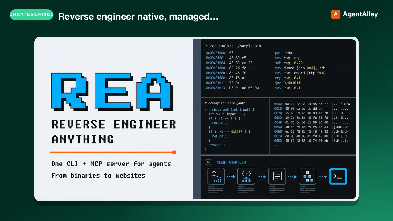 SkillCross-Platform Reverse Engineer
 morluto/rea · by morlutoReverse engineer native, managed, Electron/JavaScript, packaged, firmware, and browser targets with REA. Use shipped-artifact or requested runtime evidence to explain features, compare versions, decompile code, or guide a reconstruction. Skip REA for ordinary source-repository architecture analysis.★ 316k GitHub stars
 SkillBrainstorm Ideas
 obra/superpowers · by obraYou MUST use this before any creative work - creating features, building components, adding functionality, or modifying behavior. Explores user intent, requirements and design before implementation.★ 290k GitHub stars
 SkillCode Review Feedback Analyzerobra/superpowers · by obraUse when receiving code review feedback, before implementing suggestions, especially if feedback seems unclear or technically questionable - requires technical rigor and verification, not performative agreement or blind implementation★ 290k GitHub stars
 SkillBug Diagnosis Framework
 mattpocock/skills · by mattpocockDiagnosis loop for hard bugs and performance regressions. Use when the user says "diagnose"/"debug this", or reports something broken/throwing/failing/slow.★ 267k GitHub stars
 SkillImplement Specmattpocock/skills · by mattpocockImplement the result of /to-spec and /to-tickets in code.★ 267k GitHub stars
 SkillPR Description Writermattpocock/skills · by mattpocockUse when writing a PR body.★ 267k GitHub stars
More from wondelai
 SkillSoftware Design Philosophy
 wondelai/skills · by wondelaiManage software complexity through deep modules, information hiding, and strategic programming. Use when the user mentions "module design", "API too complex", "shallow class", "complexity budget", "strategic vs tactical", "deep module", "information leakage", "pass-through method", "this code is over-engineered", or "simplify this design". Also trigger when reviewing an interface for simplicity, evaluating whether an abstraction is pulling its weight, deciding whether a comment is worth writing, or choosing between general-purpose and special-purpose approaches. Covers deep vs shallow modules, red flags for complexity, and comments as design documentation. For code quality, see clean-code. For architecture boundaries, see clean-architecture.★ 2.2k GitHub stars
 SkillActionable Metrics Guidewondelai/skills · by wondelaiMetrics are the language of validated learning. The wrong metrics create the illusion of progress while the startup drifts toward failure.…★ 2.2k GitHub stars
 SkillAdvertising Mediawondelai/skills · by wondelaiAdvertising media is the vehicle that carries your message to your target market. Choosing the right media is not about what is trendy — it…★ 2.2k GitHub stars
 SkillAffordance Designwondelai/skills · by wondelaiAn affordance is a relationship between an object and a person that determines how the object could possibly be used. A chair affords…★ 2.2k GitHub stars
 SkillLean UX in Agile Teamswondelai/skills · by wondelaiLean UX was designed to work inside Agile development teams, not alongside them. The central mechanism is dual-track agile, where a…★ 2.2k GitHub stars
 SkillAMP Framework Practitionerwondelai/skills · by wondelaiThis reference translates the AMP framework from theory into practice across six domains: product gamification, team management,…★ 2.2k GitHub stars