iOS Typography Reference
Ios typography reference
SKILL.md section 2 covers the sizes, weights, and the six type rules (min 11pt, 1.3x line height, 35-50 chars, left-aligned,…
# iOS Typography Reference

SKILL.md section 2 covers the sizes, weights, and the six type rules (min 11pt, 1.3x line height, 35-50 chars, left-aligned, weight-over-size, 4.5:1). This file adds what it does not carry: exact light-mode color values and the Dark Mode color mapping.

## System Font: San Francisco

iOS uses San Francisco (SF Pro) as the default typeface. Always reach the styles through semantic APIs (`.font(.title)`, `.font(.body)`, `.font(.caption)`) so Dynamic Type scaling and these colors apply automatically — never hardcode the point sizes or hex values below.

## Light-Mode Color Values

The point sizes live in SKILL.md; these are the hex values iOS resolves each semantic style to in light mode.

| Element | Semantic style | Color (light) |
|---------|----------------|---------------|
| Large Title / Title / Body | `.largeTitle` `.title` `.body` | `#000000` (label) |
| Secondary text | `.subheadline` + `.secondary` | `#3C3C43` @ 60% (secondaryLabel) |
| Caption / Tertiary | `.caption` + `.secondary` | `#3C3C43` @ 60% |
| Tab bar labels (unselected) | 10pt | `#8A8A8E` (tertiaryLabel) |
Overview
SKILL.md section 2 covers the sizes, weights, and the six type rules (min 11pt, 1.3x line height, 35-50 chars, left-aligned, weight-over-size, 4.5:1). This file adds what it does not carry: exact light-mode color values and the Dark Mode color mapping.
Manual install (npx, ZIP)
npx skills add wondelai/skills --skill ios-typography-reference -g -a claude-codeConnects with Agent Alley MCP · agentalley.io/mcp
Files included
typography.md1.7 KB
Read typography.md here
wondelai/
Show the full text35 lines
iOS Typography Reference
SKILL.md section 2 covers the sizes, weights, and the six type rules (min 11pt, 1.3x line height, 35-50 chars, left-aligned, weight-over-size, 4.5:1). This file adds what it does not carry: exact light-mode color values and the Dark Mode color mapping.
System Font: San Francisco
iOS uses San Francisco (SF Pro) as the default typeface. Always reach the styles through semantic APIs (.font(.title), .font(.body), .font(.caption)) so Dynamic Type scaling and these colors apply automatically — never hardcode the point sizes or hex values below.
Light-Mode Color Values
The point sizes live in SKILL.md; these are the hex values iOS resolves each semantic style to in light mode.
| Element | Semantic style | Color (light) |
|---|---|---|
| Large Title / Title / Body | .largeTitle .title .body |
#000000 (label) |
| Secondary text | .subheadline + .secondary |
#3C3C43 @ 60% (secondaryLabel) |
| Caption / Tertiary | .caption + .secondary |
#3C3C43 @ 60% |
| Tab bar labels (unselected) | 10pt | #8A8A8E (tertiaryLabel) |
Text("Caption")
    .font(.caption)
    .foregroundColor(.secondary)   // resolves to secondaryLabel in both modes
Dark Mode Color Mapping
Semantic styles flip automatically; this is the mapping they apply so you can verify a custom color matches it:
- Primary text
#000000->#FFFFFF(label) - Secondary/tertiary gray -> lighter gray at the same opacity (secondaryLabel/tertiaryLabel)
- Backgrounds shift darker while preserving the relative hierarchy between layers
If you define a custom text color, put light/dark variants in the Asset Catalog so it follows this mapping instead of staying fixed.
| 1 | # iOS Typography Reference |
| 2 | |
| 3 | SKILL.md section 2 covers the sizes, weights, and the six type rules (min 11pt, 1.3x line height, 35-50 chars, left-aligned, weight-over-size, 4.5:1). This file adds what it does not carry: exact light-mode color values and the Dark Mode color mapping. |
| 4 | |
| 5 | ## System Font: San Francisco |
| 6 | |
| 7 | iOS uses San Francisco (SF Pro) as the default typeface. Always reach the styles through semantic APIs (`.font(.title)`, `.font(.body)`, `.font(.caption)`) so Dynamic Type scaling and these colors apply automatically — never hardcode the point sizes or hex values below. |
| 8 | |
| 9 | ## Light-Mode Color Values |
| 10 | |
| 11 | The point sizes live in SKILL.md; these are the hex values iOS resolves each semantic style to in light mode. |
| 12 | |
| 13 | | Element | Semantic style | Color (light) | |
| 14 | |---------|----------------|---------------| |
| 15 | | Large Title / Title / Body | `.largeTitle` `.title` `.body` | `#000000` (label) | |
| 16 | | Secondary text | `.subheadline` + `.secondary` | `#3C3C43` @ 60% (secondaryLabel) | |
| 17 | | Caption / Tertiary | `.caption` + `.secondary` | `#3C3C43` @ 60% | |
| 18 | | Tab bar labels (unselected) | 10pt | `#8A8A8E` (tertiaryLabel) | |
| 19 | |
| 20 | |
| 21 | Text("Caption") |
| 22 | .font(.caption) |
| 23 | .foregroundColor(.secondary) // resolves to secondaryLabel in both modes |
| 24 | |
| 25 | |
| 26 | ## Dark Mode Color Mapping |
| 27 | |
| 28 | Semantic styles flip automatically; this is the mapping they apply so you can verify a custom color matches it: |
| 29 | |
| 30 | Primary text `#000000` -> `#FFFFFF` (label) |
| 31 | Secondary/tertiary gray -> lighter gray at the same opacity (secondaryLabel/tertiaryLabel) |
| 32 | Backgrounds shift darker while preserving the relative hierarchy between layers |
| 33 | |
| 34 | If you define a custom text color, put light/dark variants in the Asset Catalog so it follows this mapping instead of staying fixed. |
| 35 |
Details
- Updated
- Sep 10, 2026
- License
- MIT
- Stars on the repo
- ★ 2,235
- Checked
- Source
- wondelai/skills ↗
- Creator
- wondelai · 319 listings
Similar skills
See all →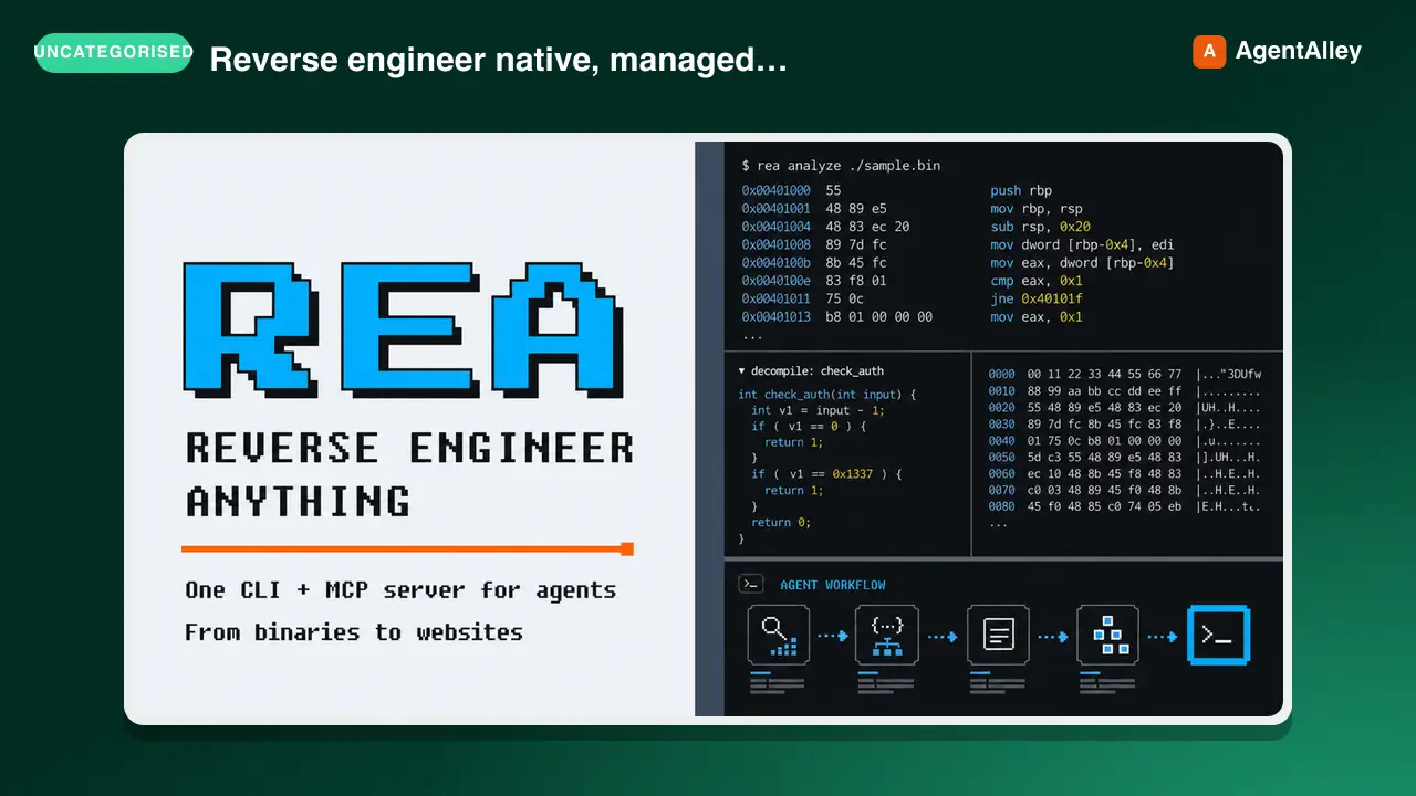 SkillCross-Platform Reverse Engineer
 morluto/rea · by morlutoReverse engineer native, managed, Electron/JavaScript, packaged, firmware, and browser targets with REA. Use shipped-artifact or requested runtime evidence to explain features, compare versions, decompile code, or guide a reconstruction. Skip REA for ordinary source-repository architecture analysis.★ 316k GitHub stars
 SkillBrainstorm Ideas
 obra/superpowers · by obraYou MUST use this before any creative work - creating features, building components, adding functionality, or modifying behavior. Explores user intent, requirements and design before implementation.★ 290k GitHub stars
 SkillCode Review Feedback Analyzerobra/superpowers · by obraUse when receiving code review feedback, before implementing suggestions, especially if feedback seems unclear or technically questionable - requires technical rigor and verification, not performative agreement or blind implementation★ 290k GitHub stars
 SkillBug Diagnosis Framework
 mattpocock/skills · by mattpocockDiagnosis loop for hard bugs and performance regressions. Use when the user says "diagnose"/"debug this", or reports something broken/throwing/failing/slow.★ 267k GitHub stars
 SkillImplement Specmattpocock/skills · by mattpocockImplement the result of /to-spec and /to-tickets in code.★ 267k GitHub stars
 SkillPR Description Writermattpocock/skills · by mattpocockUse when writing a PR body.★ 267k GitHub stars
More from wondelai
 SkillSoftware Design Philosophy
 wondelai/skills · by wondelaiManage software complexity through deep modules, information hiding, and strategic programming. Use when the user mentions "module design", "API too complex", "shallow class", "complexity budget", "strategic vs tactical", "deep module", "information leakage", "pass-through method", "this code is over-engineered", or "simplify this design". Also trigger when reviewing an interface for simplicity, evaluating whether an abstraction is pulling its weight, deciding whether a comment is worth writing, or choosing between general-purpose and special-purpose approaches. Covers deep vs shallow modules, red flags for complexity, and comments as design documentation. For code quality, see clean-code. For architecture boundaries, see clean-architecture.★ 2.2k GitHub stars
 SkillActionable Metrics Guidewondelai/skills · by wondelaiMetrics are the language of validated learning. The wrong metrics create the illusion of progress while the startup drifts toward failure.…★ 2.2k GitHub stars
 SkillAdvertising Mediawondelai/skills · by wondelaiAdvertising media is the vehicle that carries your message to your target market. Choosing the right media is not about what is trendy — it…★ 2.2k GitHub stars
 SkillAffordance Designwondelai/skills · by wondelaiAn affordance is a relationship between an object and a person that determines how the object could possibly be used. A chair affords…★ 2.2k GitHub stars
 SkillLean UX in Agile Teamswondelai/skills · by wondelaiLean UX was designed to work inside Agile development teams, not alongside them. The central mechanism is dual-track agile, where a…★ 2.2k GitHub stars
 SkillAMP Framework Practitionerwondelai/skills · by wondelaiThis reference translates the AMP framework from theory into practice across six domains: product gamification, team management,…★ 2.2k GitHub stars