iOS Navigation Patterns
Ios navigation patterns
The tab bar provides access to main app destinations.
# iOS Navigation Patterns

## Tab Bar (Primary Navigation)

The tab bar provides access to main app destinations.

- **Position**: Bottom of screen, always visible (except modals/keyboards)
- **Items**: 2-5 tabs maximum
- **Overflow**: Use "More" tab if >5 destinations needed
- **Selected state**: Fill color indicates active tab
- **Labels**: 10pt SF text
- **Background**: Slightly translucent with background blur ("frosted glass")

**Behavior**:
- Each tab remembers its navigation state
- Tapping active tab returns to root screen of that tab
- Tab bar hidden during modals and keyboard display
Overview
Behavior: - Each tab remembers its navigation state - Tapping active tab returns to root screen of that tab - Tab bar hidden during modals and keyboard display
Manual install (npx, ZIP)
Claude Code
npx skills add wondelai/skills --skill ios-navigation-patterns -g -a claude-codeClaude.ai / desktop
Codex, Cursor, other agents
Connects with Agent Alley MCP · agentalley.io/mcp
Files included
navigation.md4.5 KB
Read navigation.md here
wondelai/
navigation.md
Show the full text151 lines
iOS Navigation Patterns
Tab Bar (Primary Navigation)
The tab bar provides access to main app destinations.
- Position: Bottom of screen, always visible (except modals/keyboards)
- Items: 2-5 tabs maximum
- Overflow: Use "More" tab if >5 destinations needed
- Selected state: Fill color indicates active tab
- Labels: 10pt SF text
- Background: Slightly translucent with background blur ("frosted glass")
Behavior:
- Each tab remembers its navigation state
- Tapping active tab returns to root screen of that tab
- Tab bar hidden during modals and keyboard display
Navigation Bar (Contextual Navigation)
- Back button: Top-left, allows return to previous screen
- Actions: Top-right, context-specific actions
- Title: Center (scrolled state) or left-aligned large title (unscrolled)
Scroll Behavior:
- Large title collapses to compact centered title on scroll
- Search bar can move or hide on scroll
- Smooth animated transitions between states
Navigating Back
| Method | Context |
|---|---|
| "Back" button (top-left) | Standard navigation |
| Swipe right from left edge | Standard navigation |
| "Cancel" / "Done" button | Modal views |
| Swipe down on content | Modals, fullscreen media |
Modal Sheets
Use modals for focused tasks that shouldn't interrupt context completely.
- Slides up from bottom
- Previous screen visible (recessed) in background
- Dismiss via: close button, swipe down, or completing task
Search UI Patterns
Search Bar Placement
| Context | Placement |
|---|---|
| Primary search (core feature) | Navigation bar, persistent |
| Secondary search | Below nav, hidden on scroll |
| List filtering | Above list, inline |
Search Behavior
States:
- Inactive: Placeholder text, magnifying glass icon
- Active/Focused: Keyboard appears, cancel button shows
- Typing: Results update (instant or debounced)
- Results: Displayed in list below
SwiftUI implementation:
.searchable(
    text: $searchText,
    placement: .navigationBarDrawer(displayMode: .always),
    prompt: "Search items"
)
Search Suggestions
- Recent searches
- Trending/popular searches
- Autocomplete suggestions
- Scoped suggestions (filter by category)
.searchable(text: $searchText) {
    ForEach(suggestions) { suggestion in
        Text(suggestion.name)
            .searchCompletion(suggestion.name)
    }
}
Split View Navigation (iPad)
Two-Column Layout
┌──────────────────┬────────────────────────────────┐
│                  │                                │
│  Primary List    │     Detail View                │
│  (Sidebar)       │                                │
│                  │                                │
│  Item 1          │     Selected item details      │
│  Item 2 ←        │                                │
│  Item 3          │                                │
│                  │                                │
└──────────────────┴────────────────────────────────┘
Behavior:
- Primary column: 320pt default width
- Detail column: Fills remaining space
- Collapse to single column on compact width
Three-Column Layout
┌────────────┬────────────┬──────────────────────────┐
│  Sidebar   │ Content    │    Detail                │
│            │            │                          │
│  Section 1 │  Item A    │    Item details here     │
│  Section 2 │  Item B ←  │                          │
│  Section 3 │  Item C    │                          │
└────────────┴────────────┴──────────────────────────┘
SwiftUI:
NavigationSplitView {
    Sidebar()
} content: {
    ContentList()
} detail: {
    DetailView()
}
Responsive Behavior
| Width | Behavior |
|---|---|
| Compact (iPhone) | Stack navigation |
| Regular (iPad portrait) | Two-column or overlay |
| Regular (iPad landscape) | Three-column available |
Best practices:
- Show placeholder in detail when nothing selected
- Remember selection across rotation
- Support column resizing (where appropriate)
| 1 | # iOS Navigation Patterns |
| 2 | |
| 3 | ## Tab Bar (Primary Navigation) |
| 4 | |
| 5 | The tab bar provides access to main app destinations. |
| 6 | |
| 7 | **Position**: Bottom of screen, always visible (except modals/keyboards) |
| 8 | **Items**: 2-5 tabs maximum |
| 9 | **Overflow**: Use "More" tab if >5 destinations needed |
| 10 | **Selected state**: Fill color indicates active tab |
| 11 | **Labels**: 10pt SF text |
| 12 | **Background**: Slightly translucent with background blur ("frosted glass") |
| 13 | |
| 14 | **Behavior**: |
| 15 | Each tab remembers its navigation state |
| 16 | Tapping active tab returns to root screen of that tab |
| 17 | Tab bar hidden during modals and keyboard display |
| 18 | |
| 19 | ## Navigation Bar (Contextual Navigation) |
| 20 | |
| 21 | **Back button**: Top-left, allows return to previous screen |
| 22 | **Actions**: Top-right, context-specific actions |
| 23 | **Title**: Center (scrolled state) or left-aligned large title (unscrolled) |
| 24 | |
| 25 | **Scroll Behavior**: |
| 26 | Large title collapses to compact centered title on scroll |
| 27 | Search bar can move or hide on scroll |
| 28 | Smooth animated transitions between states |
| 29 | |
| 30 | ## Navigating Back |
| 31 | |
| 32 | | Method | Context | |
| 33 | |--------|---------| |
| 34 | | "Back" button (top-left) | Standard navigation | |
| 35 | | Swipe right from left edge | Standard navigation | |
| 36 | | "Cancel" / "Done" button | Modal views | |
| 37 | | Swipe down on content | Modals, fullscreen media | |
| 38 | |
| 39 | ## Modal Sheets |
| 40 | |
| 41 | Use modals for focused tasks that shouldn't interrupt context completely. |
| 42 | |
| 43 | Slides up from bottom |
| 44 | Previous screen visible (recessed) in background |
| 45 | Dismiss via: close button, swipe down, or completing task |
| 46 | |
| 47 | |
| 48 | |
| 49 | ## Search UI Patterns |
| 50 | |
| 51 | ### Search Bar Placement |
| 52 | |
| 53 | | Context | Placement | |
| 54 | |---------|-----------| |
| 55 | | Primary search (core feature) | Navigation bar, persistent | |
| 56 | | Secondary search | Below nav, hidden on scroll | |
| 57 | | List filtering | Above list, inline | |
| 58 | |
| 59 | ### Search Behavior |
| 60 | |
| 61 | **States:** |
| 62 | **Inactive:** Placeholder text, magnifying glass icon |
| 63 | **Active/Focused:** Keyboard appears, cancel button shows |
| 64 | **Typing:** Results update (instant or debounced) |
| 65 | **Results:** Displayed in list below |
| 66 | |
| 67 | **SwiftUI implementation:** |
| 68 | |
| 69 | .searchable( |
| 70 | text: $searchText, |
| 71 | placement: .navigationBarDrawer(displayMode: .always), |
| 72 | prompt: "Search items" |
| 73 | ) |
| 74 | |
| 75 | |
| 76 | ### Search Suggestions |
| 77 | |
| 78 | Recent searches |
| 79 | Trending/popular searches |
| 80 | Autocomplete suggestions |
| 81 | Scoped suggestions (filter by category) |
| 82 | |
| 83 | |
| 84 | .searchable(text: $searchText) { |
| 85 | ForEach(suggestions) { suggestion in |
| 86 | Text(suggestion.name) |
| 87 | .searchCompletion(suggestion.name) |
| 88 | } |
| 89 | } |
| 90 | |
| 91 | |
| 92 | |
| 93 | |
| 94 | ## Split View Navigation (iPad) |
| 95 | |
| 96 | ### Two-Column Layout |
| 97 | |
| 98 | |
| 99 | ┌──────────────────┬────────────────────────────────┐ |
| 100 | │ │ │ |
| 101 | │ Primary List │ Detail View │ |
| 102 | │ (Sidebar) │ │ |
| 103 | │ │ │ |
| 104 | │ Item 1 │ Selected item details │ |
| 105 | │ Item 2 ← │ │ |
| 106 | │ Item 3 │ │ |
| 107 | │ │ │ |
| 108 | └──────────────────┴────────────────────────────────┘ |
| 109 | |
| 110 | |
| 111 | **Behavior:** |
| 112 | Primary column: 320pt default width |
| 113 | Detail column: Fills remaining space |
| 114 | Collapse to single column on compact width |
| 115 | |
| 116 | ### Three-Column Layout |
| 117 | |
| 118 | |
| 119 | ┌────────────┬────────────┬──────────────────────────┐ |
| 120 | │ Sidebar │ Content │ Detail │ |
| 121 | │ │ │ │ |
| 122 | │ Section 1 │ Item A │ Item details here │ |
| 123 | │ Section 2 │ Item B ← │ │ |
| 124 | │ Section 3 │ Item C │ │ |
| 125 | └────────────┴────────────┴──────────────────────────┘ |
| 126 | |
| 127 | |
| 128 | **SwiftUI:** |
| 129 | |
| 130 | NavigationSplitView { |
| 131 | Sidebar() |
| 132 | } content: { |
| 133 | ContentList() |
| 134 | } detail: { |
| 135 | DetailView() |
| 136 | } |
| 137 | |
| 138 | |
| 139 | ### Responsive Behavior |
| 140 | |
| 141 | | Width | Behavior | |
| 142 | |-------|----------| |
| 143 | | Compact (iPhone) | Stack navigation | |
| 144 | | Regular (iPad portrait) | Two-column or overlay | |
| 145 | | Regular (iPad landscape) | Three-column available | |
| 146 | |
| 147 | **Best practices:** |
| 148 | Show placeholder in detail when nothing selected |
| 149 | Remember selection across rotation |
| 150 | Support column resizing (where appropriate) |
| 151 |
Details
- Updated
- Sep 10, 2026
- License
- MIT
- Stars on the repo
- ★ 2,235
- Checked
- Source
- wondelai/skills ↗
- Creator
- wondelai · 319 listings
Similar skills
See all →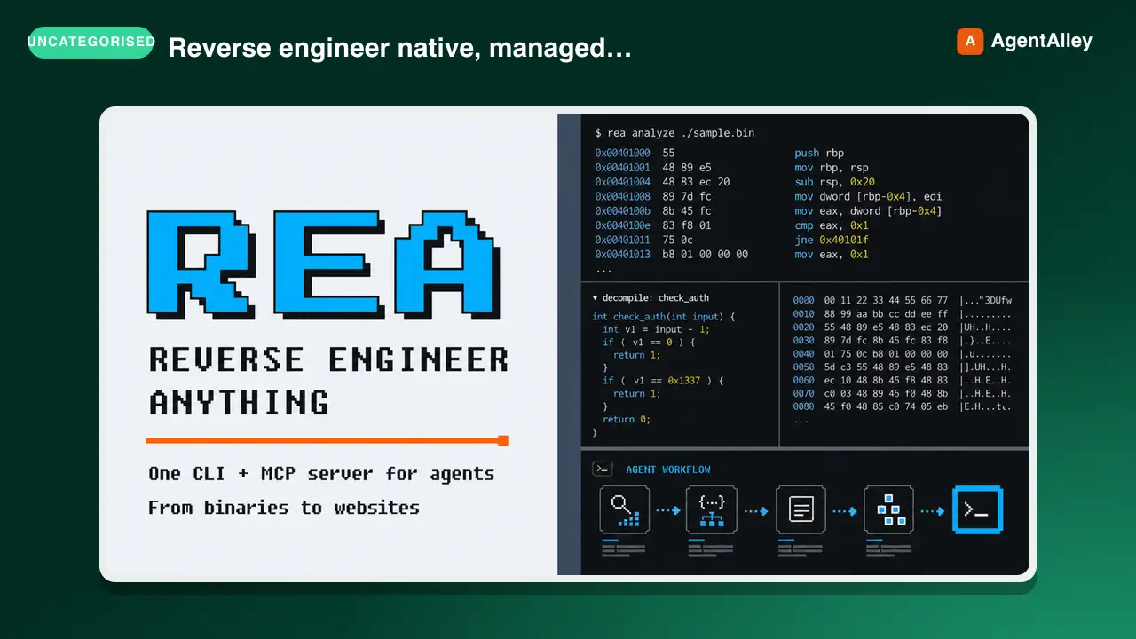 SkillCross-Platform Reverse Engineer
 morluto/rea · by morlutoReverse engineer native, managed, Electron/JavaScript, packaged, firmware, and browser targets with REA. Use shipped-artifact or requested runtime evidence to explain features, compare versions, decompile code, or guide a reconstruction. Skip REA for ordinary source-repository architecture analysis.★ 316k GitHub stars
 SkillBrainstorm Ideas
 obra/superpowers · by obraYou MUST use this before any creative work - creating features, building components, adding functionality, or modifying behavior. Explores user intent, requirements and design before implementation.★ 290k GitHub stars
 SkillCode Review Feedback Analyzerobra/superpowers · by obraUse when receiving code review feedback, before implementing suggestions, especially if feedback seems unclear or technically questionable - requires technical rigor and verification, not performative agreement or blind implementation★ 290k GitHub stars
 SkillBug Diagnosis Framework
 mattpocock/skills · by mattpocockDiagnosis loop for hard bugs and performance regressions. Use when the user says "diagnose"/"debug this", or reports something broken/throwing/failing/slow.★ 267k GitHub stars
 SkillImplement Specmattpocock/skills · by mattpocockImplement the result of /to-spec and /to-tickets in code.★ 267k GitHub stars
 SkillPR Description Writermattpocock/skills · by mattpocockUse when writing a PR body.★ 267k GitHub stars
More from wondelai
 SkillSoftware Design Philosophy
 wondelai/skills · by wondelaiManage software complexity through deep modules, information hiding, and strategic programming. Use when the user mentions "module design", "API too complex", "shallow class", "complexity budget", "strategic vs tactical", "deep module", "information leakage", "pass-through method", "this code is over-engineered", or "simplify this design". Also trigger when reviewing an interface for simplicity, evaluating whether an abstraction is pulling its weight, deciding whether a comment is worth writing, or choosing between general-purpose and special-purpose approaches. Covers deep vs shallow modules, red flags for complexity, and comments as design documentation. For code quality, see clean-code. For architecture boundaries, see clean-architecture.★ 2.2k GitHub stars
 SkillActionable Metrics Guidewondelai/skills · by wondelaiMetrics are the language of validated learning. The wrong metrics create the illusion of progress while the startup drifts toward failure.…★ 2.2k GitHub stars
 SkillAdvertising Mediawondelai/skills · by wondelaiAdvertising media is the vehicle that carries your message to your target market. Choosing the right media is not about what is trendy — it…★ 2.2k GitHub stars
 SkillAffordance Designwondelai/skills · by wondelaiAn affordance is a relationship between an object and a person that determines how the object could possibly be used. A chair affords…★ 2.2k GitHub stars
 SkillLean UX in Agile Teamswondelai/skills · by wondelaiLean UX was designed to work inside Agile development teams, not alongside them. The central mechanism is dual-track agile, where a…★ 2.2k GitHub stars
 SkillAMP Framework Practitionerwondelai/skills · by wondelaiThis reference translates the AMP framework from theory into practice across six domains: product gamification, team management,…★ 2.2k GitHub stars