Architecture Diagram Generator
Architecture Diagram Skill
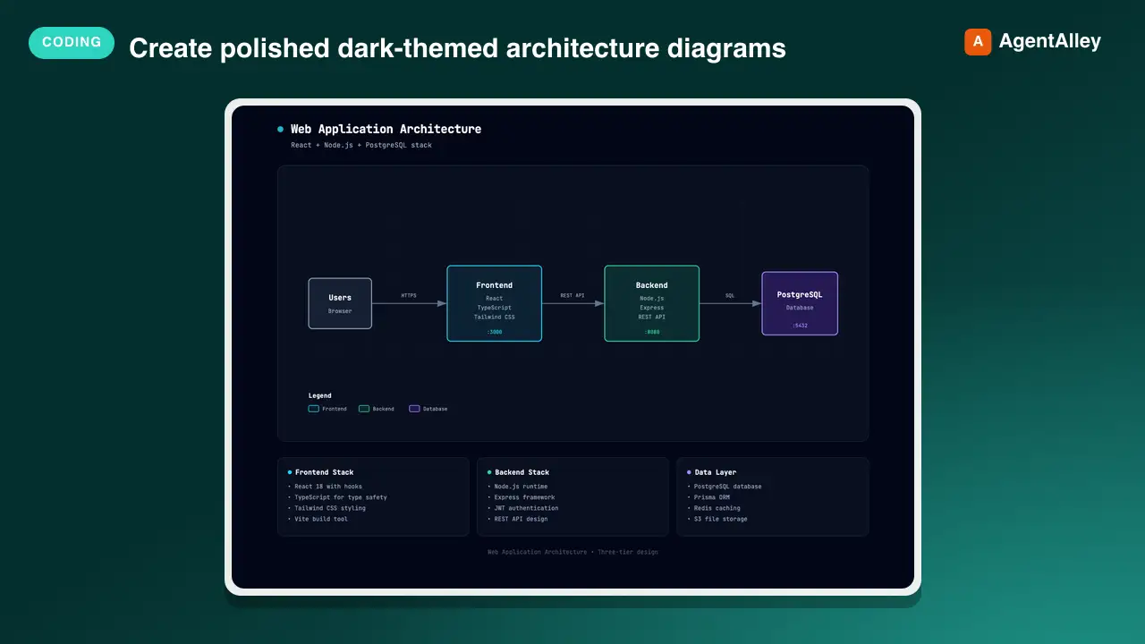
Create polished dark-themed architecture diagrams as self-contained HTML+SVG files. Use when the user asks for system, infrastructure, cloud, security, or network topology diagrams.
---
name: architecture-diagram
description: Create polished dark-themed architecture diagrams as self-contained HTML+SVG files. Use when the user asks for system, infrastructure, cloud, security, or network topology diagrams.
---

# Architecture Diagram Skill

Create professional technical architecture diagrams as self-contained HTML files with inline SVG graphics and CSS styling.

> **Version 1.1** · MIT License · Authored by [Cocoon AI](mailto:hello@cocoon-ai.com)

## Design System

### Color Palette

Use these semantic colors for component types:

| Component Type | Fill (rgba) | Stroke |
Overview
Create professional technical architecture diagrams as self-contained HTML files with inline SVG graphics and CSS styling.
What you get
- Embedded CSS (no external stylesheets except Google Fonts)
- Inline SVG (no external images)
- No JavaScript required (pure CSS animations)
Manual install (npx, ZIP)
npx skills add Cocoon-AI/architecture-diagram-generator --skill architecture-diagram -g -a claude-codenpx degit Cocoon-AI/architecture-diagram-generator/architecture-diagram#main ~/.claude/skills/architecture-diagram-2Connects with Agent Alley MCP · agentalley.io/mcp
Files included
SKILL.md8.2 KB
Read SKILL.md here
Show the full text178 lines
Architecture Diagram Skill
Create professional technical architecture diagrams as self-contained HTML files with inline SVG graphics and CSS styling.
Version 1.1 · MIT License · Authored by Cocoon AI
Design System
Color Palette
Use these semantic colors for component types:
| Component Type | Fill (rgba) | Stroke |
|---|---|---|
| Frontend | rgba(8, 51, 68, 0.4) |
#22d3ee (cyan-400) |
| Backend | rgba(6, 78, 59, 0.4) |
#34d399 (emerald-400) |
| Database | rgba(76, 29, 149, 0.4) |
#a78bfa (violet-400) |
| AWS/Cloud | rgba(120, 53, 15, 0.3) |
#fbbf24 (amber-400) |
| Security | rgba(136, 19, 55, 0.4) |
#fb7185 (rose-400) |
| Message Bus | rgba(251, 146, 60, 0.3) |
#fb923c (orange-400) |
| External/Generic | rgba(30, 41, 59, 0.5) |
#94a3b8 (slate-400) |
Typography
Use JetBrains Mono for all text (monospace, technical aesthetic):
<link href="https://fonts.googleapis.com/css2?family=JetBrains+Mono:wght@400;500;600;700&display=swap" rel="stylesheet">
Font sizes: 12px for component names, 9px for sublabels, 8px for annotations, 7px for tiny labels.
Visual Elements
Background: #020617 (slate-950) with subtle grid pattern:
<pattern id="grid" width="40" height="40" patternUnits="userSpaceOnUse">
  <path d="M 40 0 L 0 0 0 40" fill="none" stroke="#1e293b" stroke-width="0.5"/>
</pattern>
Component boxes: Rounded rectangles (rx="6") with 1.5px stroke, semi-transparent fills.
Security groups: Dashed stroke (stroke-dasharray="4,4"), transparent fill, rose color.
Region boundaries: Larger dashed stroke (stroke-dasharray="8,4"), amber color, rx="12".
Arrows: Use SVG marker for arrowheads:
<marker id="arrowhead" markerWidth="10" markerHeight="7" refX="9" refY="3.5" orient="auto">
  <polygon points="0 0, 10 3.5, 0 7" fill="#64748b" />
</marker>
Arrow z-order: Draw connection arrows early in the SVG (after the background grid) so they render behind component boxes. SVG elements are painted in document order, so arrows drawn first will appear behind shapes drawn later.
Masking arrows behind transparent fills: Since component boxes use semi-transparent fills (rgba(..., 0.4)), arrows behind them will show through. To fully mask arrows, draw an opaque background rect (e.g., fill="#0f172a") at the same position before drawing the semi-transparent styled rect on top:
<!-- Opaque background to mask arrows -->
<rect x="X" y="Y" width="W" height="H" rx="6" fill="#0f172a"/>
<!-- Styled component on top -->
<rect x="X" y="Y" width="W" height="H" rx="6" fill="rgba(76, 29, 149, 0.4)" stroke="#a78bfa" stroke-width="1.5"/>
Auth/security flows: Dashed lines in rose color (#fb7185).
Message buses / Event buses: Small connector elements between services. Use orange color (#fb923c stroke, rgba(251, 146, 60, 0.3) fill):
<rect x="X" y="Y" width="120" height="20" rx="4" fill="rgba(251, 146, 60, 0.3)" stroke="#fb923c" stroke-width="1"/>
<text x="CENTER_X" y="Y+14" fill="#fb923c" font-size="7" text-anchor="middle">Kafka / RabbitMQ</text>
Spacing Rules
CRITICAL: When stacking components vertically, ensure proper spacing to avoid overlaps:
- Standard component height: 60px for services, 80-120px for larger components
- Minimum vertical gap between components: 40px
- Inline connectors (message buses): Place IN the gap between components, not overlapping
Example vertical layout:
Component A: y=70,  height=60  → ends at y=130
Gap:         y=130 to y=170   → 40px gap, place bus at y=140 (20px tall)
Component B: y=170, height=60  → ends at y=230
Wrong: Placing a message bus at y=160 when Component B starts at y=170 (causes overlap) Right: Placing a message bus at y=140, centered in the 40px gap (y=130 to y=170)
Legend Placement
CRITICAL: Place legends OUTSIDE all boundary boxes (region boundaries, cluster boundaries, security groups).
- Calculate where all boundaries end (y position + height)
- Place legend at least 20px below the lowest boundary
- Expand SVG viewBox height if needed to accommodate
Example:
Kubernetes Cluster: y=30, height=460 → ends at y=490
Legend should start at: y=510 or below
SVG viewBox height: at least 560 to fit legend
Wrong: Legend at y=470 inside a cluster boundary that ends at y=490 Right: Legend at y=510, below the cluster boundary, with viewBox height extended
Layout Structure
- Header - Title with pulsing dot indicator, subtitle, and export toolbar
- Main SVG diagram - Contained in rounded border card
- Summary cards - Grid of 3 cards below diagram with key details
- Footer - Minimal metadata line
Export Toolbar (built-in)
Every diagram ships with a single unobtrusive ⋯ toggle in the header. Click it to reveal three buttons — 📋 Copy (high-DPI PNG to clipboard, scale: 2), 🖼️ PNG (high-DPI PNG download), 📄 PDF (PNG embedded in a one-page PDF via jsPDF). The toolbar collapses back to the icon by default so it doesn't clutter the diagram. All three formats use the same html2canvas capture (with the toolbar excluded and 32px padding around the content), so PDF preserves the dark theme without going through the browser's print dialog.
When generating a new diagram, keep these intact in the template:
- The two CDN scripts in
<head>(pinned versions, with Subresource Integrity hashes andcrossorigin="anonymous"):https://cdn.jsdelivr.net/npm/html2canvas@1.4.1/dist/html2canvas.min.js—integrity="sha384-ZZ1pncU3bQe8y31yfZdMFdSpttDoPmOZg2wguVK9almUodir1PghgT0eY7Mrty8H"https://cdn.jsdelivr.net/npm/jspdf@2.5.2/dist/jspdf.umd.min.js—integrity="sha384-en/ztfPSRkGfME4KIm05joYXynqzUgbsG5nMrj/xEFAHXkeZfO3yMK8QQ+mP7p1/"- SRI ensures generated diagrams are tamper-resistant against CDN compromise. Do not modify the hashes; if the version is bumped, the new hash must be computed fresh.
id="report-container"on the outermost.containerdiv (this is what gets captured).toolbarmarkup with.toolbar-actions(collapsed by default) and.toolbar-toggle(the⋯button).toolbarCSS +@media print { .toolbar { display: none !important; } }copyAsImage(),downloadPNG(), anddownloadPDF()script before</body>, all usinggetBoundingClientRect()+html2canvas(document.body, { x, y, width, height, ignoreElements })to capture a precise rect with breathing room and no toolbar
Caveats: clipboard API needs a user gesture and a secure context (https/file/localhost). SVG <foreignObject> renders inconsistently in html2canvas — stick to plain <svg> shapes and <text>. Bump scale: 2 to 3 or 4 for higher-res output.
Component Box Pattern
<rect x="X" y="Y" width="W" height="H" rx="6" fill="FILL_COLOR" stroke="STROKE_COLOR" stroke-width="1.5"/>
<text x="CENTER_X" y="Y+20" fill="white" font-size="11" font-weight="600" text-anchor="middle">LABEL</text>
<text x="CENTER_X" y="Y+36" fill="#94a3b8" font-size="9" text-anchor="middle">sublabel</text>
Info Card Pattern
<div class="card">
  <div class="card-header">
    <div class="card-dot COLOR"></div>
    <h3>Title</h3>
  </div>
  <ul>
    <li>• Item one</li>
    <li>• Item two</li>
  </ul>
</div>
Template
Copy and customize the template at resources/template.html. Key customization points:
- Update the
<title>and header text - Modify SVG viewBox dimensions if needed (default:
1000 x 680) - Add/remove/reposition component boxes
- Draw connection arrows between components
- Update the three summary cards
- Update footer metadata
Output
Always produce a single self-contained .html file with:
- Embedded CSS (no external stylesheets except Google Fonts)
- Inline SVG (no external images)
- No JavaScript required (pure CSS animations)
The file should render correctly when opened directly in any modern browser. The export toolbar uses two CDN scripts (html2canvas and jsPDF) — no other JavaScript dependencies.
| 1 | |
| 2 | name architecture-diagram |
| 3 | description Create polished dark-themed architecture diagrams as self-contained HTML+SVG files. Use when the user asks for system, infrastructure, cloud, security, or network topology diagrams. |
| 4 | |
| 5 | |
| 6 | # Architecture Diagram Skill |
| 7 | |
| 8 | Create professional technical architecture diagrams as self-contained HTML files with inline SVG graphics and CSS styling. |
| 9 | |
| 10 | > **Version 1.1** · MIT License · Authored by [Cocoon AI] |
| 11 | |
| 12 | ## Design System |
| 13 | |
| 14 | ### Color Palette |
| 15 | |
| 16 | Use these semantic colors for component types: |
| 17 | |
| 18 | | Component Type | Fill (rgba) | Stroke | |
| 19 | |---------------|-------------|--------| |
| 20 | | Frontend | `rgba(8, 51, 68, 0.4)` | `#22d3ee` (cyan-400) | |
| 21 | | Backend | `rgba(6, 78, 59, 0.4)` | `#34d399` (emerald-400) | |
| 22 | | Database | `rgba(76, 29, 149, 0.4)` | `#a78bfa` (violet-400) | |
| 23 | | AWS/Cloud | `rgba(120, 53, 15, 0.3)` | `#fbbf24` (amber-400) | |
| 24 | | Security | `rgba(136, 19, 55, 0.4)` | `#fb7185` (rose-400) | |
| 25 | | Message Bus | `rgba(251, 146, 60, 0.3)` | `#fb923c` (orange-400) | |
| 26 | | External/Generic | `rgba(30, 41, 59, 0.5)` | `#94a3b8` (slate-400) | |
| 27 | |
| 28 | ### Typography |
| 29 | |
| 30 | Use JetBrains Mono for all text (monospace, technical aesthetic): |
| 31 | |
| 32 | <link href="https://fonts.googleapis.com/css2?family=JetBrains+Mono:wght@400;500;600;700&display=swap" rel="stylesheet"> |
| 33 | |
| 34 | |
| 35 | Font sizes: 12px for component names, 9px for sublabels, 8px for annotations, 7px for tiny labels. |
| 36 | |
| 37 | ### Visual Elements |
| 38 | |
| 39 | **Background:** `#020617` (slate-950) with subtle grid pattern: |
| 40 | |
| 41 | <pattern id="grid" width="40" height="40" patternUnits="userSpaceOnUse"> |
| 42 | <path d="M 40 0 L 0 0 0 40" fill="none" stroke="#1e293b" stroke-width="0.5"/> |
| 43 | </pattern> |
| 44 | |
| 45 | |
| 46 | **Component boxes:** Rounded rectangles (`rx="6"`) with 1.5px stroke, semi-transparent fills. |
| 47 | |
| 48 | **Security groups:** Dashed stroke (`stroke-dasharray="4,4"`), transparent fill, rose color. |
| 49 | |
| 50 | **Region boundaries:** Larger dashed stroke (`stroke-dasharray="8,4"`), amber color, `rx="12"`. |
| 51 | |
| 52 | **Arrows:** Use SVG marker for arrowheads: |
| 53 | |
| 54 | <marker id="arrowhead" markerWidth="10" markerHeight="7" refX="9" refY="3.5" orient="auto"> |
| 55 | <polygon points="0 0, 10 3.5, 0 7" fill="#64748b" /> |
| 56 | </marker> |
| 57 | |
| 58 | |
| 59 | **Arrow z-order:** Draw connection arrows early in the SVG (after the background grid) so they render behind component boxes. SVG elements are painted in document order, so arrows drawn first will appear behind shapes drawn later. |
| 60 | |
| 61 | **Masking arrows behind transparent fills:** Since component boxes use semi-transparent fills (`rgba(..., 0.4)`), arrows behind them will show through. To fully mask arrows, draw an opaque background rect (e.g., `fill="#0f172a"`) at the same position before drawing the semi-transparent styled rect on top: |
| 62 | |
| 63 | <!-- Opaque background to mask arrows --> |
| 64 | <rect x="X" y="Y" width="W" height="H" rx="6" fill="#0f172a"/> |
| 65 | <!-- Styled component on top --> |
| 66 | <rect x="X" y="Y" width="W" height="H" rx="6" fill="rgba(76, 29, 149, 0.4)" stroke="#a78bfa" stroke-width="1.5"/> |
| 67 | |
| 68 | |
| 69 | **Auth/security flows:** Dashed lines in rose color (`#fb7185`). |
| 70 | |
| 71 | **Message buses / Event buses:** Small connector elements between services. Use orange color (`#fb923c` stroke, `rgba(251, 146, 60, 0.3)` fill): |
| 72 | |
| 73 | <rect x="X" y="Y" width="120" height="20" rx="4" fill="rgba(251, 146, 60, 0.3)" stroke="#fb923c" stroke-width="1"/> |
| 74 | <text x="CENTER_X" y="Y+14" fill="#fb923c" font-size="7" text-anchor="middle">Kafka / RabbitMQ</text> |
| 75 | |
| 76 | |
| 77 | ### Spacing Rules |
| 78 | |
| 79 | **CRITICAL:** When stacking components vertically, ensure proper spacing to avoid overlaps: |
| 80 | |
| 81 | **Standard component height:** 60px for services, 80-120px for larger components |
| 82 | **Minimum vertical gap between components:** 40px |
| 83 | **Inline connectors (message buses):** Place IN the gap between components, not overlapping |
| 84 | |
| 85 | **Example vertical layout:** |
| 86 | |
| 87 | Component A: y=70, height=60 → ends at y=130 |
| 88 | Gap: y=130 to y=170 → 40px gap, place bus at y=140 (20px tall) |
| 89 | Component B: y=170, height=60 → ends at y=230 |
| 90 | |
| 91 | |
| 92 | **Wrong:** Placing a message bus at y=160 when Component B starts at y=170 (causes overlap) |
| 93 | **Right:** Placing a message bus at y=140, centered in the 40px gap (y=130 to y=170) |
| 94 | |
| 95 | ### Legend Placement |
| 96 | |
| 97 | **CRITICAL:** Place legends OUTSIDE all boundary boxes (region boundaries, cluster boundaries, security groups). |
| 98 | |
| 99 | Calculate where all boundaries end (y position + height) |
| 100 | Place legend at least 20px below the lowest boundary |
| 101 | Expand SVG viewBox height if needed to accommodate |
| 102 | |
| 103 | **Example:** |
| 104 | |
| 105 | Kubernetes Cluster: y=30, height=460 → ends at y=490 |
| 106 | Legend should start at: y=510 or below |
| 107 | SVG viewBox height: at least 560 to fit legend |
| 108 | |
| 109 | |
| 110 | **Wrong:** Legend at y=470 inside a cluster boundary that ends at y=490 |
| 111 | **Right:** Legend at y=510, below the cluster boundary, with viewBox height extended |
| 112 | |
| 113 | ### Layout Structure |
| 114 | |
| 115 | **Header** - Title with pulsing dot indicator, subtitle, and export toolbar |
| 116 | **Main SVG diagram** - Contained in rounded border card |
| 117 | **Summary cards** - Grid of 3 cards below diagram with key details |
| 118 | **Footer** - Minimal metadata line |
| 119 | |
| 120 | ### Export Toolbar (built-in) |
| 121 | |
| 122 | Every diagram ships with a single unobtrusive `⋯` toggle in the header. Click it to reveal three buttons — 📋 Copy (high-DPI PNG to clipboard, scale: 2), 🖼️ PNG (high-DPI PNG download), 📄 PDF (PNG embedded in a one-page PDF via jsPDF). The toolbar collapses back to the icon by default so it doesn't clutter the diagram. All three formats use the same html2canvas capture (with the toolbar excluded and 32px padding around the content), so PDF preserves the dark theme without going through the browser's print dialog. |
| 123 | |
| 124 | When generating a new diagram, keep these intact in the template: |
| 125 | The two CDN scripts in `<head>` (pinned versions, with Subresource Integrity hashes and `crossorigin="anonymous"`): |
| 126 | `https://cdn.jsdelivr.net/npm/html2canvas@1.4.1/dist/html2canvas.min.js` — `integrity="sha384-ZZ1pncU3bQe8y31yfZdMFdSpttDoPmOZg2wguVK9almUodir1PghgT0eY7Mrty8H"` |
| 127 | `https://cdn.jsdelivr.net/npm/jspdf@2.5.2/dist/jspdf.umd.min.js` — `integrity="sha384-en/ztfPSRkGfME4KIm05joYXynqzUgbsG5nMrj/xEFAHXkeZfO3yMK8QQ+mP7p1/"` |
| 128 | SRI ensures generated diagrams are tamper-resistant against CDN compromise. Do not modify the hashes; if the version is bumped, the new hash must be computed fresh. |
| 129 | `id="report-container"` on the outermost `.container` div (this is what gets captured) |
| 130 | `.toolbar` markup with `.toolbar-actions` (collapsed by default) and `.toolbar-toggle` (the `⋯` button) |
| 131 | `.toolbar` CSS + `@media print { .toolbar { display: none !important; } }` |
| 132 | `copyAsImage()`, `downloadPNG()`, and `downloadPDF()` script before `</body>`, all using `getBoundingClientRect()` + `html2canvas(document.body, { x, y, width, height, ignoreElements })` to capture a precise rect with breathing room and no toolbar |
| 133 | |
| 134 | Caveats: clipboard API needs a user gesture and a secure context (https/file/localhost). SVG `<foreignObject>` renders inconsistently in html2canvas — stick to plain `<svg>` shapes and `<text>`. Bump `scale: 2` to `3` or `4` for higher-res output. |
| 135 | |
| 136 | ### Component Box Pattern |
| 137 | |
| 138 | |
| 139 | <rect x="X" y="Y" width="W" height="H" rx="6" fill="FILL_COLOR" stroke="STROKE_COLOR" stroke-width="1.5"/> |
| 140 | <text x="CENTER_X" y="Y+20" fill="white" font-size="11" font-weight="600" text-anchor="middle">LABEL</text> |
| 141 | <text x="CENTER_X" y="Y+36" fill="#94a3b8" font-size="9" text-anchor="middle">sublabel</text> |
| 142 | |
| 143 | |
| 144 | ### Info Card Pattern |
| 145 | |
| 146 | |
| 147 | <div class="card"> |
| 148 | <div class="card-header"> |
| 149 | <div class="card-dot COLOR"></div> |
| 150 | <h3>Title</h3> |
| 151 | </div> |
| 152 | <ul> |
| 153 | <li>• Item one</li> |
| 154 | <li>• Item two</li> |
| 155 | </ul> |
| 156 | </div> |
| 157 | |
| 158 | |
| 159 | ## Template |
| 160 | |
| 161 | Copy and customize the template at `resources/template.html`. Key customization points: |
| 162 | |
| 163 | Update the `<title>` and header text |
| 164 | Modify SVG viewBox dimensions if needed (default: `1000 x 680`) |
| 165 | Add/remove/reposition component boxes |
| 166 | Draw connection arrows between components |
| 167 | Update the three summary cards |
| 168 | Update footer metadata |
| 169 | |
| 170 | ## Output |
| 171 | |
| 172 | Always produce a single self-contained `.html` file with: |
| 173 | Embedded CSS (no external stylesheets except Google Fonts) |
| 174 | Inline SVG (no external images) |
| 175 | No JavaScript required (pure CSS animations) |
| 176 | |
| 177 | The file should render correctly when opened directly in any modern browser. The export toolbar uses two CDN scripts (html2canvas and jsPDF) — no other JavaScript dependencies. |
| 178 |
Details
- License
- MIT
- Stars on the repo
- ★ 7,405
- Checked
- Source
- Cocoon-AI/architecture-diagram-generator ↗
- Creator
- Cocoon-AI · 1 listing
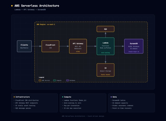
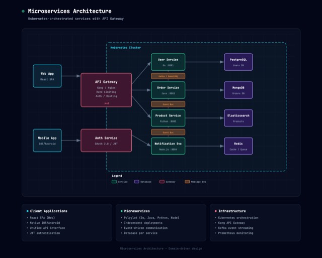
Made with architecture-diagram
Similar skills
See all → SkillCustom Diagram Designer
 cathrynlavery/diagram-design · by cathrynlaveryCreate branded architecture, architecture delta, IT current-state, flowchart, sequence, state machine, ER/data model, timeline, swimlane, quadrant, radar/spider, polar chart (polar/radial lollipop), loop/flywheel, nested, tree, org chart, layer stack, Venn, pyramid/funnel, treemap and marimekko, heatmap, bar and dumbbell, waterfall, line (slopegraph, ridgeline, streamgraph, bump), Gantt and scatter charts (bubble, beeswarm), high-level, process, medallion, data flow, DP integration, DP security matrix, Sankey, fishbone, Wardley map, kanban, user journey, deployment, dependency graph, UML class, story map, or database schema diagrams as HTML/SVG/PNG, with .drawio, Mermaid, and .excalidraw import, plus lifecycle phase maps, block decomposition trees, and onboarding guidance.★ 43.2k GitHub stars
 SkillArchitecture Pattern Reviewer
 pascalorg/editor · by pascalorgReview a PR against the Pascal architectural rules — package boundaries (core/viewer/editor/nodes), the registry-driven composition model (def.geometry / def.renderer / def.system), legacy-dispatch regressions, the slots + world-scale-UV convention for new nodes/geometry, hook hygiene (useEditor/useScene/useViewer), and selector performance. Use when the user asks to review a PR, audit a branch, or check that changes respect the codebase's architecture.★ 24.6k GitHub stars
 SkillArchitecture Diagram Creator
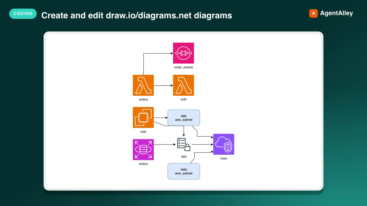
 Agents365-ai/drawio-skill · by Agents365-aiCreate and edit draw.io/diagrams.net diagrams as editable `.drawio` files. Covers architecture, UML/ERD/sequence, BPMN, network, and swimlane views authored from a description or converted from code, IaC, SQL, and API schemas, plus sync, query, test, review, export, and publish of existing diagrams. Use when the user asks for draw.io/diagrams.net or an editable diagram; prefer Mermaid/PlantUML when diagrams-as-code is enough.★ 9.8k GitHub stars
 SkillLLM Knowledge Distillation
 Ar9av/obsidian-wiki · by Ar9avThe foundational knowledge distillation pattern for building and maintaining an AI-powered Obsidian wiki. Based on Andrej Karpathy's LLM Wiki architecture. Use this skill whenever the user wants to understand the wiki pattern, set up a new knowledge base, or needs guidance on the three-layer architecture (raw sources → wiki → schema). Also use when discussing knowledge management strategy, wiki structure decisions, or how to organize distilled knowledge. This is the "theory" skill — other skills handle specific operations (ingesting, querying, linting).★ 3.5k GitHub stars
 SkillSoftware Design Philosophy
 wondelai/skills · by wondelaiManage software complexity through deep modules, information hiding, and strategic programming. Use when the user mentions "module design", "API too complex", "shallow class", "complexity budget", "strategic vs tactical", "deep module", "information leakage", "pass-through method", "this code is over-engineered", or "simplify this design". Also trigger when reviewing an interface for simplicity, evaluating whether an abstraction is pulling its weight, deciding whether a comment is worth writing, or choosing between general-purpose and special-purpose approaches. Covers deep vs shallow modules, red flags for complexity, and comments as design documentation. For code quality, see clean-code. For architecture boundaries, see clean-architecture.★ 2.2k GitHub stars
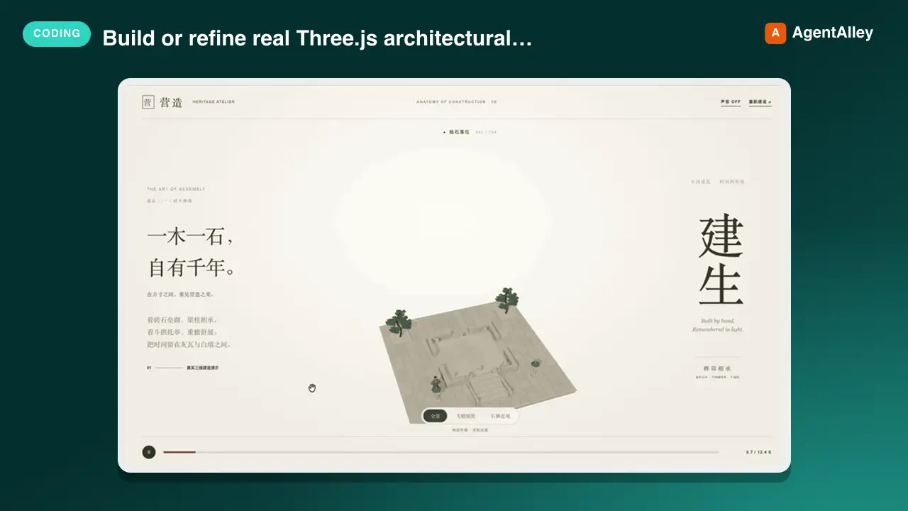 SkillThree.js Architecture Animator
 lhlGitHub/threejs-architecture-effects · by lhlGitHubBuild or refine real Three.js architectural construction animations, especially Chinese pavilions, pagodas and clock towers with brick-by-brick growth, timber framing, layered eaves, procedural PBR materials and interactive detail cameras. Use for 3D建筑生长、古建搭建特效、楼台逐层建造、建筑动态组装 or similar architectural miniatures; not for flat image reveals or generic website styling.★ 584 GitHub stars